Sirio Color (Fedrigoni) - The Best Colored Paper System?
adminShare
Austin from Print Peppermint gives a detailed overview of the Sirio Color System from Fedrigoni Paper
Table of Contents:
00:00 - Start
00:19 - Overview
00:46 - Paper Thickness Guide
00:50 - 10 pt / 210 gsm
00:56 - 20 pt / 420 gsm
01:02 - 30 pt / 630 gsm
01:08 - 40 pt / 840 gsm
01:16 - 50 pt / 1050 gsm
01:23 - 10 pt Thickness - Closeup Side View
01:41 - 20 pt Thickness - Closeup Side View
02:03 - 30 pt Thickness - Closeup Side View
02:28 - 40 pt Thickness - Closeup Side View
02:43 - 50 pt Thickness - Closeup Side View
02:56 - 5 Paper Thickness Comparison (Side by Side)
03:38 - Text Weight Guide, Line Weight Guide, Text Size Guide
04:32 - Logo Sizes on Business Card
Paper Colors:
04:53 - Wedding White (Bright White)
05:16 - Milk Shake (Off-White)
05:37 - Antique Ivory ( Natural White / Cream)
05:49 - Lemon (Bright Yellow) 05:58 - Sunshine (Marigold)
06:15 - Orange
06:27 - Vermillion (Red)
06:53 - Rasberry (Red)
07:12 - Cherry (Deep Red)
07:24 - Vino (Purple)
07:34 - Lime (Neon Green)
07:44 - Foliage (Green) 08:01 - Sky (Light Blue)
08:12 - Deep Sky (Blue)
08:17 - Royal (Blue)
08:33 - Blue
08:40 - Dark Blue
08:47 - Cacao 08:55 - Nude (Blush, Fleshtone, Pinkish-White)
09:18 - Cashmere (Gray-Brown)
09:30 - Dark Gray
09:40 - Light Gray
09:47 - Khaki (light brown)
09:58 - Ultra Black + PMS 877 Metallic Ink
10:32 - Warm Gray 10:37 - Sand
10:48 - Coffee (Slate Brown, Muted) 10:58 - Flamingo (Coral)
11:08 - Royal Green (Slate Green)
Closing Thoughts: =============================
11:20 - Benefits of Printing on Colored Paper vs White Paper
Extras: =============================
Official Fedrigoni - Sirio Color Overview https://youtu.be/yQHRjx5R6Kc
Transcription:
How do you do internet folks? Austin here with printpeppermint.com, and today, I am ultra excited to show you our brand new colored paper sample bundle. Let's get creative. ♪ [music] ♪ So, this is what our colored paper sample bundle looks like. You can order it in the sample section on our website.
And it says right here on the cover that our 100% recyclable color system performs exceptionally well across all printing processes. These stocks adapt perfectly to any application from business cards to boxes. Twenty-nine colors, five standard weights, and a luxuriously smooth uncoated finish. Next up in the sample bundle, you will find our thickness guide.
It starts off with 210 grams or 10 points, then it moves to 20 points or 420 grams. The next one is 3 layers of paper, 30 points, 630 grams. The fourth one is 4 layers of paper, 840 grams or 40 points.
And the last one is 50 points or 1,050 grams, measuring at 1.2 millimeters. First up in the thickness guide is 10 points. It looks like this, it is reasonably bendy, and is basically considered sort of a premium copier type paper thickness, similar to something you might have in your home office.
Next one up is 20 points or 420 grams. It looks like this. This is a super macro lens. So, there may be some nicks already. And you can see it's a lot less bendable. And this starts to be what I would consider a standard thickness for a business card.
Next up in the bundle is 30 points. And this is where things start to really get premium. I will show this next to the 10 points so you can see the difference. You can see it is basically three times as thick and it is quite rigid and reasonably difficult to bend.
Next up in the bundle is 40 points, and it looks like this. It is super duper hard to bend, and it is very, very, very premium and very, very rigid. And last, but certainly not least, is 50 points, which is absolutely ridiculous.
But sometimes, you just got to do it. I will attempt to show these to you all side by side so you can get an impression of how rigidity is as you increase the weight or thickness of a stock.
And no matter what color you choose in our bundle, we can make that color in any of these five thicknesses. You can see on the 10-point, it already has sort of the corner nicked a little bit and it's reasonably easy to bend, then the 20-point a little less so, 30-point a little less so, 40-point hardly at all, and the 50-point, just ridiculous.
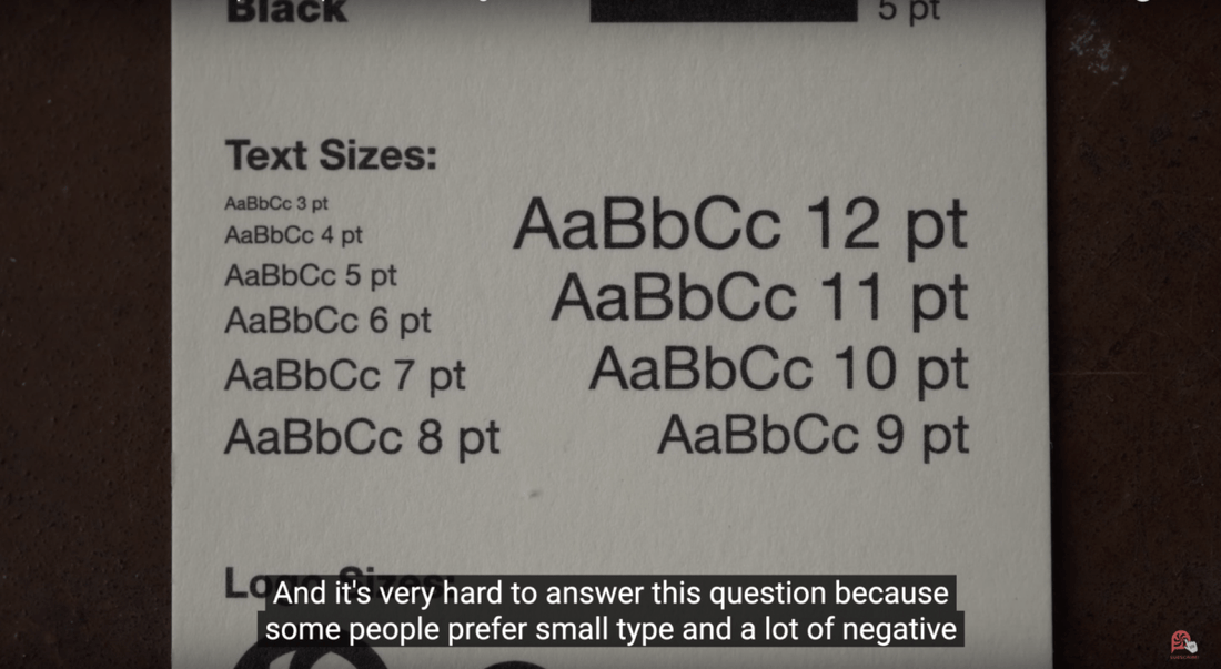
So, next up in the bundle, you will see a line weight, text weight, and text size guide. We've shown you line weights starting at 0.5 points up to 5 points and text weights from thin all the way up to bold and black. And we get this question all the time.
What size should I make my text? And so, we thought we'd make this handy tool that shows font sizes from 3 points all the way up to 12 points. And it's very hard to answer this question because some people prefer small type and a lot of negative or open space in their design. I'm also one of those people.
But some people want to just make sure that their text is just quite as legible as possible. And so, they will opt for something like a 9, 10, 11, or 12-point. We also show our little logo down here, starting at a 0.5 inch down to 0.05 inch, just again, to show clarity and detail, what's possible with this stock, and, yeah, just to help you plan for your design.
So, next up in the bundle, we go ahead and we start with our colors. This is wedding white, shown here in a 20-point thickness, printed with a spot color black on the offset press, on the Heidelberg. This is a premium bright white. It's not super cold, it's not super yellow, it's right in the middle.
And it is chlorine free so you can feel good about it. Next up in the bundle is a paper called milk shake, which is also premium white, but a bit softer, a little bit warmer, a little bit creamier, hence the name milk shake. And shown here, again, with black PMS offset spot color.
Now, we start to get a little creamier. We've got antique ivory. This is, as you can see, a more ivory, a more yellow, a creamier paper. Not much else to say there. Now, we start to get a bit wild. This one we call lemon.
It is a super bright yellow shown with wonderful contrast with the spot black ink. Next up in the bundle is sunshine. This is sort of a orangey color in between yellow and orange. So, yeah, think of like orange, the fruit, and has perfect contrast here with the spot black ink. Next up in the bundle is your classic orange.
It looks like this. Again, printed with spot black ink show n in a 20-point or 420 gsm thickness. Now, we have a red that we call vermillion. This is printed with the Pantone PMS 877 metallic ink. When we do the second version of this bundle, I might switch this out for like a matte white foil for a little bit more contrast.
But I can certainly read the text. It becomes a little bit lost at certain angles of the paper but for the most part, it works okay. Same thing goes for this next one called raspberry. This is a color that gets a little bit more magenta but it's still a very good red, printed with 877 metallic silver.
Again, I think the contrast could be better. We'll probably revise that on the second run of this bundle. Then we move to a nice deep red we like to call cherry, shown in 20-point thickness, with an ample amount of contrast, in my opinion, using PMS 877 metallic ink. Next in the bundle is vino, a beautiful purple paper with Pantone PMS 877 metallic.
Next up in the bundle, we have a bright line green with a lot of contrast using the Pantone spot color black. Here is a standard sort of green.
We call it foliage because we're fancy around here. It's, again, printed with PMS 877 silver. To my eye, there could be a little bit more contrast here. So, we might revise this in the second version of the bundle. Here is a sky blue which, as you can see, looks like a light blue. It has ample contrast with the black ink and could be wonderful.
Next, we have deep sky printed with a spot black. And then we have royal which is a standard blue printed with 877 metallic. Probably could have a little bit better contrast here as well.
Maybe a foil would be a better option, but I can read everything. Here, we have our standard blue in this bundle with a great amount of contrast using 877 silver. Then we have a dark blue which is a beautiful combination with this 877 silver. Next in the bundle, we have cacao printed with 877 silver.
Then we have one of my favorite colors in the bundle. And I don't know if this will come up perfectly on camera but this is a sort of blushy kind of red-white. It's a white base but it just leans ever so slightly towards pink or red. So, it kind of has a flesh tone which is why we call it nude.
This is the paper we used on the five sheets of the thickness guide earlier in the bundle. Next up, we have cashmere number 20. It looks like this. It is a sort of mix of gray and a light brown. Then we have dark gray printed with 877 silver. I probably would do this with black or with a foil in the next time around.
Then we have light gray. It looks like this, ample contrast with that spot offset black. Next up, we have khaki which is a sort of light, sandy, camel kind of brown. Looks great with the black ink printed. And here we go, everybody's favorite, black shown in a massive 42-point thickness and a beautiful combination with Pantone PMS 877 silver metallic ink.
If you want to have that kind of shimmer, but you don't like the overly mirror-like or reflective quality of metalized foils, then the 877 is a great sort of middle ground that gives you a little bit of shimmer but isn't overwhelming and isn't too obnoxious. Next up in the bundle, we have warm gray.
Number 26 we have sand, which is a very, very, very light brown. So, think of the khaki but super, super light. Coffee, which is a sort of slate brown, I would call it, still a deep color but a little bit desaturated.
Next one in the bundle is one of my favorites because pink and coral are the print peppermint colors. And we call this one flamingo. Last one in the bundle is a slate green that we call royal green. And it looks wonderful with the Pantone PMS 877 silver metallic. So, one of the benefits of using colored paper as opposed to flooding a white sheet with ink is that you get a, first of all, super consistent color that you can count on.
These are pre-dyed from the paper mill and they soaked \the fibers in dye. And even if I were to rip this paper in half, you would see that the internal fibers of the sheet are also blue. And the edges are also colored, which is one thing I really hate about flooding white paper with color is that it leaves the edges white unless you paint them or foil stamp on them, which some people do.
And sometimes, for certain projects, that's a good idea. But when I can get away with it, I really prefer to use pre-dyed colored papers and foil stamp on them or spot ink on them. So, that's one of the reasons I want to make this video to explain some of the benefits of using colored paper. You could also do really nifty things like combine papers.
Let's say you want to have like a super line green on one side of your card and a deep green on the other side. You can glue these together. We do that all the time, duplexing. And that achieves all kinds of really interesting results. And one of the side benefits of that is when you have two colored papers and you glue them together, the edge profile there is multicolored.
So, that's also an interesting experience for users when they are looking at a printed piece in their hands. And another thing about when you flood white paper with ink, it does have the possibility of sort of destabilizing the fibers a little bit. Think about a kitchen towel, when you soak up a spill, how it starts to sort of deteriorate and break down and fall apart the more moisture that it absorbs.
So, paper is a similar sort of thing. And that's one reason I don't like to do it. Another thing is that with really deep colors, like blue and black, sometimes you can get some ink kind of rub off while the cards are in a box next to the other cards with temperature changes. Another thing I hate about it is if you have a dark color printed on a white sheet and somebody nicks the corner of your card or has it in their pocket all day and it gets a little bit moist, you start to see very quickly the white fraying on the edges.
And to me, it just kind of doesn't really exude a sort of quality of luxuriousness. It looks cheap and it looks sort of after the fact or something. So, again, that's one reason why, when I can, when the budget's there, when the design is appropriate, I like to use pre-dyed colored papers and use spot colored inks or foils.
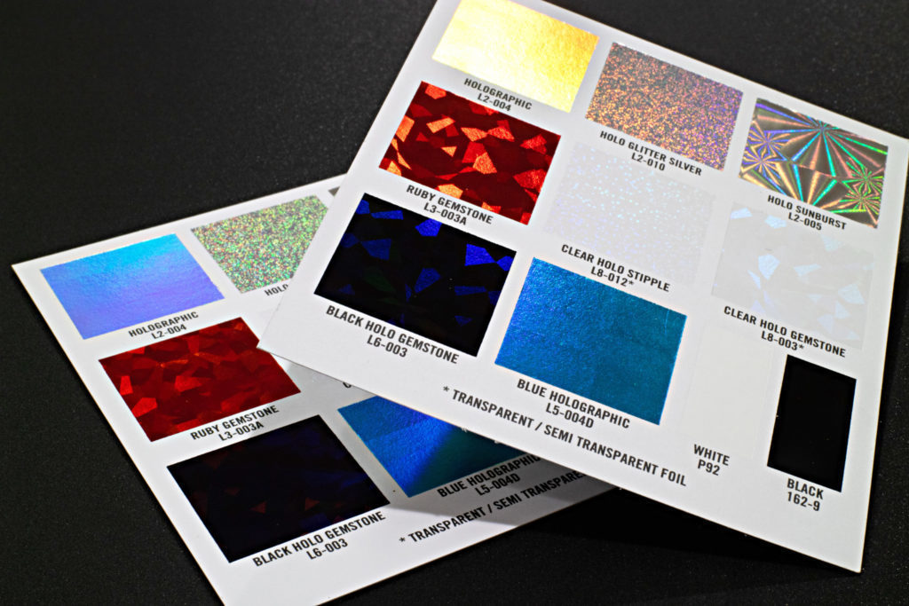
And when I say foil, don't think that you're limited to just metallic foil. We have a variety of foils. We have matte metallic foils, which are still a bit shimmery but a lot more subtle and subdued. But we also have pigment foils, which basically look like flat ink when they're applied and that's a great way to take a dark paper and get very light text on it or a light logo.
All right, that's it for today. I hope you learned a little something about paper. If you have some questions, feel free to leave them in the comments below and I will do my best to answer them in a quick manner. And we will catch you in the next one. ♪


