The Peppermint Studio
Design something worth holding.
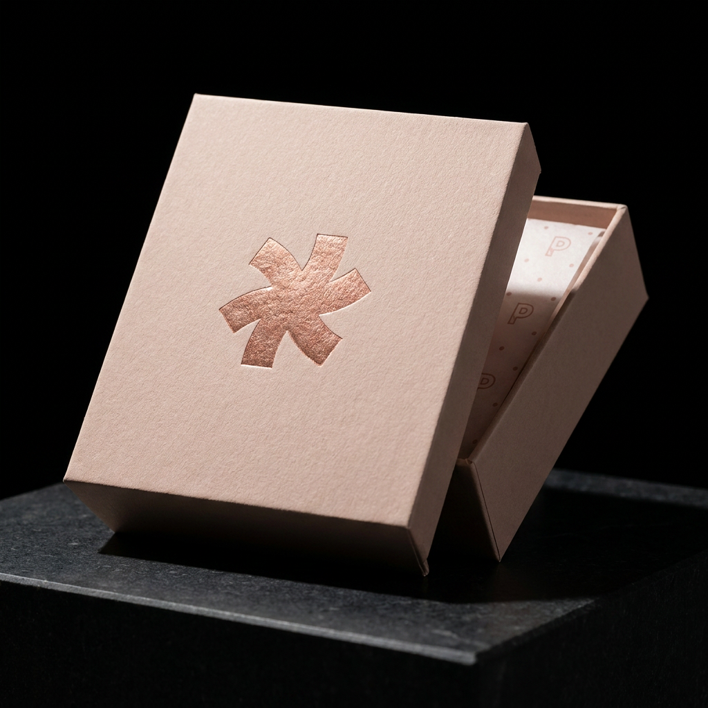
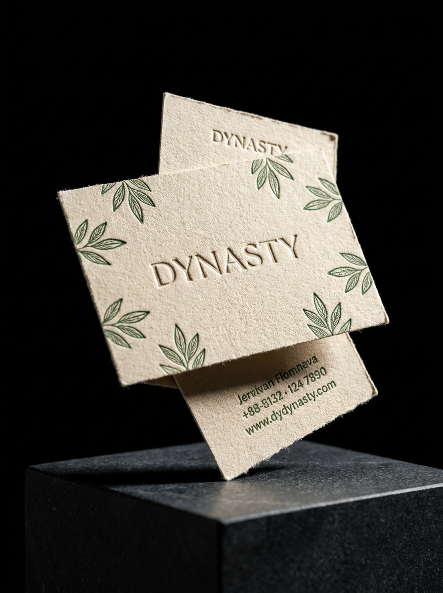
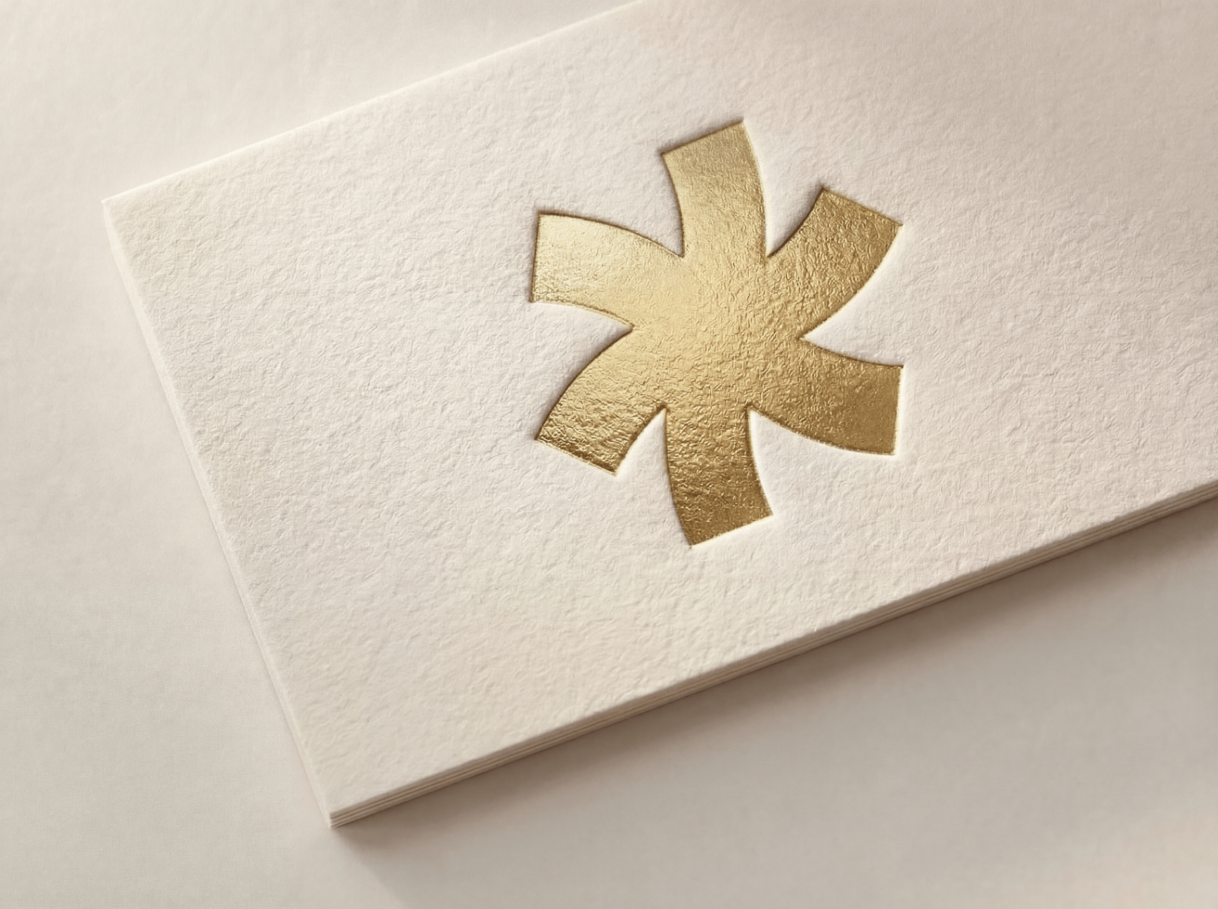
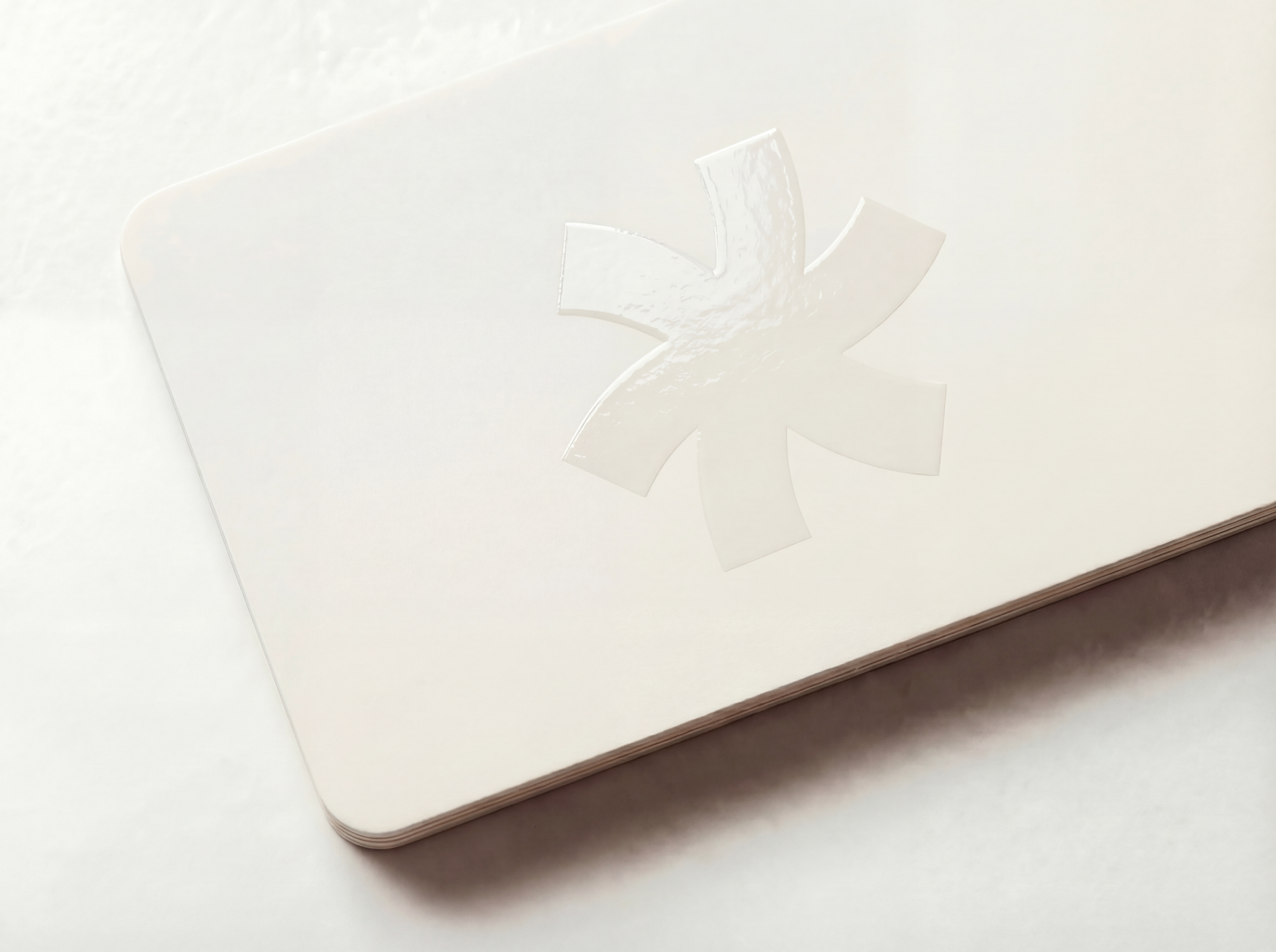
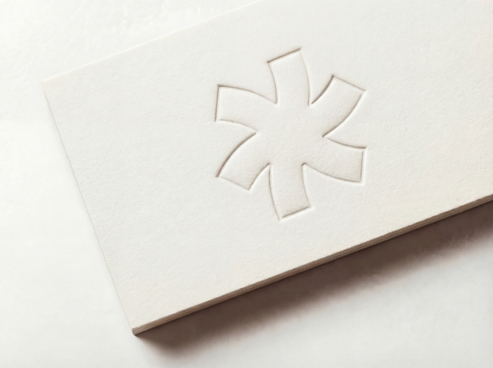
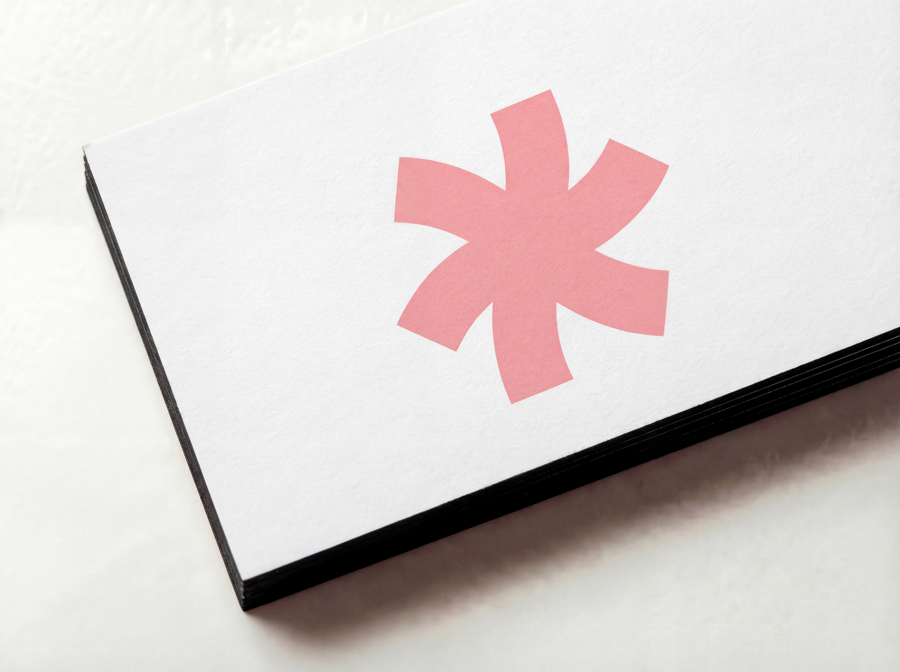
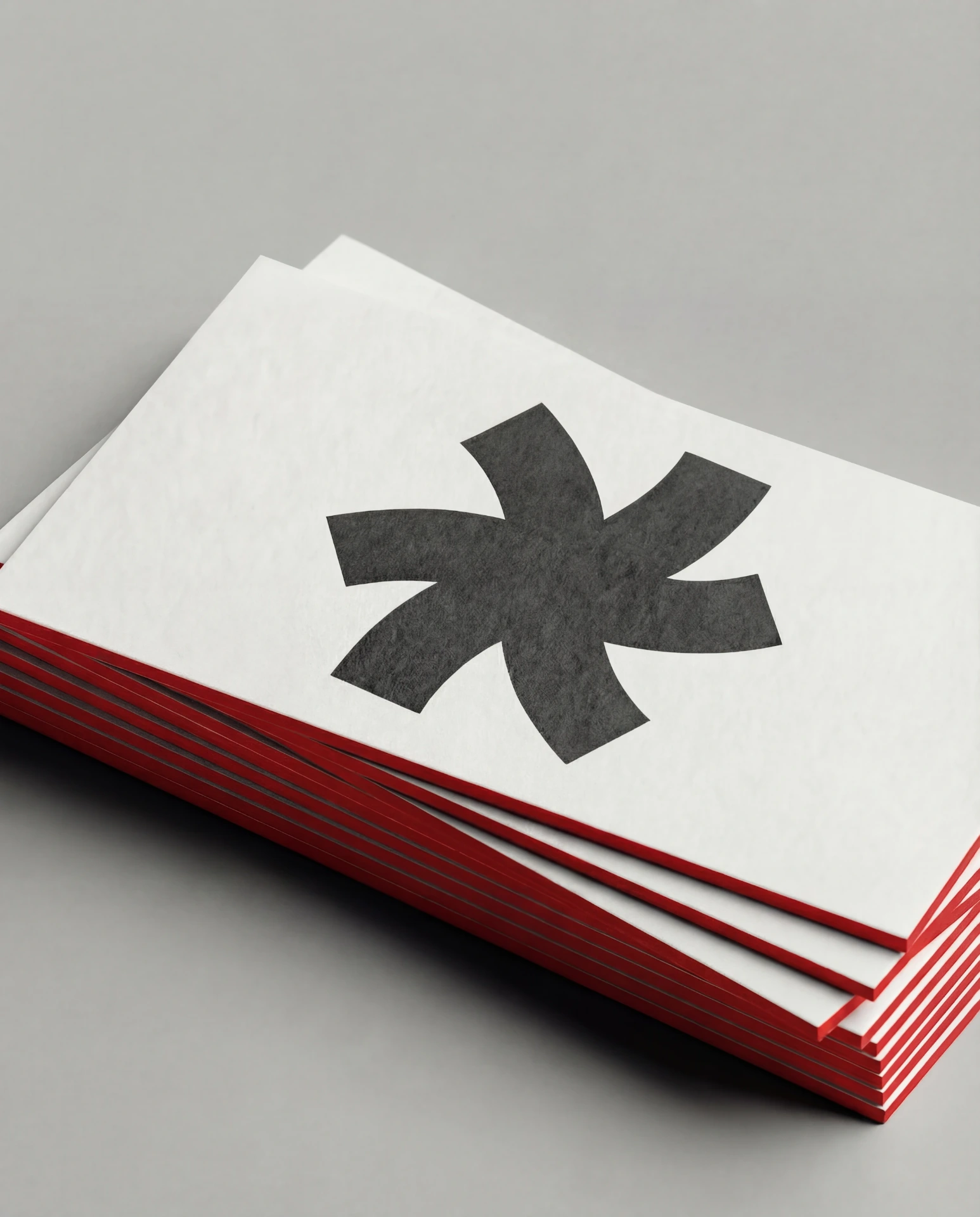
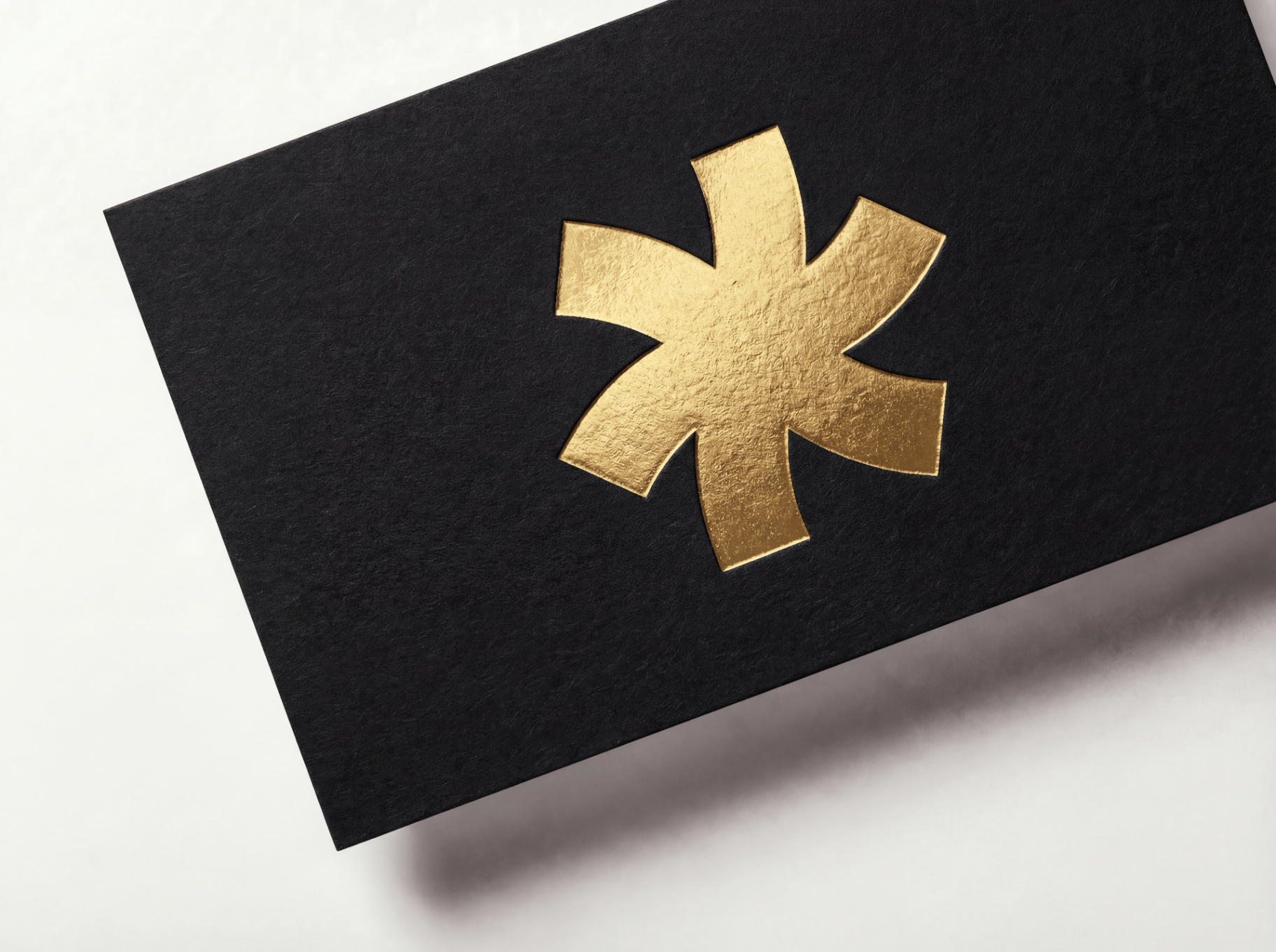
Foil, letterpress, emboss, edge paint — conceived with AI in minutes, perfected by our studio. The material is the message.


%20--%3e%3csvg%20version='1.1'%20id='Layer_1'%20xmlns='http://www.w3.org/2000/svg'%20xmlns:xlink='http://www.w3.org/1999/xlink'%20x='0px'%20y='0px'%20viewBox='0%200%20300%20150'%20style='enable-background:new%200%200%20300%20150;'%20xml:space='preserve'%3e%3cstyle%20type='text/css'%3e%20.st0{fill-rule:evenodd;clip-rule:evenodd;fill:%23808285;}%20%3c/style%3e%3cpath%20class='st0'%20d='M195.6,52.8c2.3,2.6,7.2,2.5,10.2,4.4c-4,1-9,1-12.6,2.4C194.1,57.4,194.8,55.1,195.6,52.8'/%3e%3cpath%20class='st0'%20d='M167.4,61.8c-1.2,5.5-3.7,11.7-5.1,17.7c7.7,0.1,15.9-1.5,23.8-1.9c1.1-1.4,1.6-3.4,2.2-5.3%20c1.6,2.3,2.7,6.5,1.2,9.7c-12.1-0.2-20.7,9.7-32.6,9.7c-5.3,0-9.8-3-7.3-9C153.2,74.3,162,68.4,167.4,61.8'/%3e%3cpath%20class='st0'%20d='M289,44.1c0.3,1.2-1,2.3-1.7,3.2c-5.7,7.2-12.1,15.7-19.7,21.1c0.6,2.9,0.3,6.7-0.7,8.7c2,2.6,4.1,5,5.3,8.3%20c-1.6,8.6-5.4,15.3-11.4,19.7c-5.9,4.3-13.8,5.9-22.9,8c-17.4,4-46.1,8-59.1-2.4c-14,8.2-42.3,9.3-55.4-0.5%20c-9.3,11.8-46,10.8-40.6-12.6c-6.8,5.2-16.9,12.3-26.5,16.3c-11.1,4.6-32.2,4.1-30.1-11.7c0.3-1.9,1-2.9,1.9-4.6%20c-3.3-5.7-5.3-9.6-7.3-14.6c-1.9-4.7-4.8-10.1-5.1-16.8c-0.7-14.1,10.3-23,21.1-27.2c5.6-2.1,10.1-5.2,15.6-6.8%20c8.2-2.3,15.3,2.2,15.8,9.7c9.5-2.8,21.2-6,33.8-4.1c10-7.8,29.6-3,42.5,0.7c2.9,0.8,6.8,3,9,2.9c1.8-0.1,5.1-2.6,7-3.4%20c9-4,20.9-8.3,33.8-6.1c2.4,0.4,4.7,1.7,7.3,1.9c1.8,0.2,3.9-0.4,5.8-0.5C237.7,31.9,262.9,40,289,44.1%20M204.4,43.1%20c-3.1,0.4-5.3,3.7-7.3,4.9c0.1,0,0.3,0,0.2-0.2c0.4-1.7,1.1-3,1.2-4.9c-16.2-5.7-31.9,2.6-43.5,9c-9.3,5.1-17.5,11.1-23.3,17%20c2.1-3.6,4.3-7.1,6.8-10.4c2.5-3.4,5.3-6.5,7.5-9.5c-4.8-1.3-9.7-2.6-14.6-3.6c-6.9-1.5-16.6-3.9-22.4-0.7c-1.7,0.9-3,3.2-4.6,3.4%20c-1.3,0.2-3.5-0.8-5.1-1c-5.9-0.7-11.4-0.1-16.8,1c-5,1-15.7,2.8-17,7.5c-0.9,3,1.1,6,0.7,9c-0.3,3-3.2,6.9-4.6,9.2%20c-1.8,2.9-3.6,5.5-6.6,6.8c-1.8-9.1,0.2-17.1,1.7-24.8c1-4.7,2.9-9.6,1.2-14.3c-4.6-0.6-8.5,3-13.1,4.9c-8.6,3.5-18.2,6.6-19.4,16.5%20c-0.7,5.6,1.4,9.2,2.9,13.1c3.2,8.5,7.2,15.8,11.9,22.4c-1.3,2.4-4.3,3-4.6,6.3c1.4,1.9,4.2,2.2,7.1,2.2c8.2,0,14.8-4.1,20.9-7.5%20C76.9,91.8,85.7,80.4,95,69.6c1.6-1.9,3-4.2,5.1-5.3c2.1,9.6-2,14.7-4.9,22.6c-1.1,3-4.6,12.5-2.9,17c1.9,4.9,17.9,5.2,22.1,2%20c2.1-1.6,3-5.3,4.1-7.5c1.5-2.9,2.7-5.4,3.9-8c0.1,10.6,8,13.8,16.5,16c18.2,4.8,36.5-3.8,46.4-9.7c-1.2,7.9,1.8,8.7,8,10%20c16,3.3,32.2-0.5,45.2-3.7c12-2.9,21.6-4.9,23.3-16.8c-1.9-1.7-6.7-1.5-10-1c-9.6,1.4-19,6.3-31.8,5.3c-2.3-0.2-7.4-1-7.8-2.4%20c-0.6-2.2,3.5-3.8,6.8-4.4c9.6-1.6,23.6,0,31.3-2.9c3.7-1.4,8.2-5.5,7.8-10c-0.3-3-4.3-4.6-8-4.9c-10.6-0.7-18.2,5.5-29.4,3.4%20c1.4-1.8,1.6-4.7,3.4-6.1c8.2-0.2,16.1,1.5,23.8,1c10.7-0.7,16.8-5.2,21.9-11.2c0.5-0.6,1.9-1.3,1.5-2.4%20C252.8,47.8,227.4,40.3,204.4,43.1'/%3e%3c/svg%3e)
How ordering works
Three paths, one standard.
All paths use the same production standards — they differ only in configuration and guidance. Choose the path that fits your project.
Quick Ship
Fast, fixed configurations with predictable pricing.
Standard specifications, quick turnaround. Upload your design, approve a proof, receive your cards in days. Best for straightforward projects with defined needs.
Studio
Pre-configured, production-tested combinations with premium materials.
Choose from curated paper and finish pairings with expert guidance. Produced with care over approximately 3 weeks.
Custom
Full collaboration for complex requirements.
No constraints, no catalog limitations. Describe your vision, receive a custom quote, and work directly with our production team.
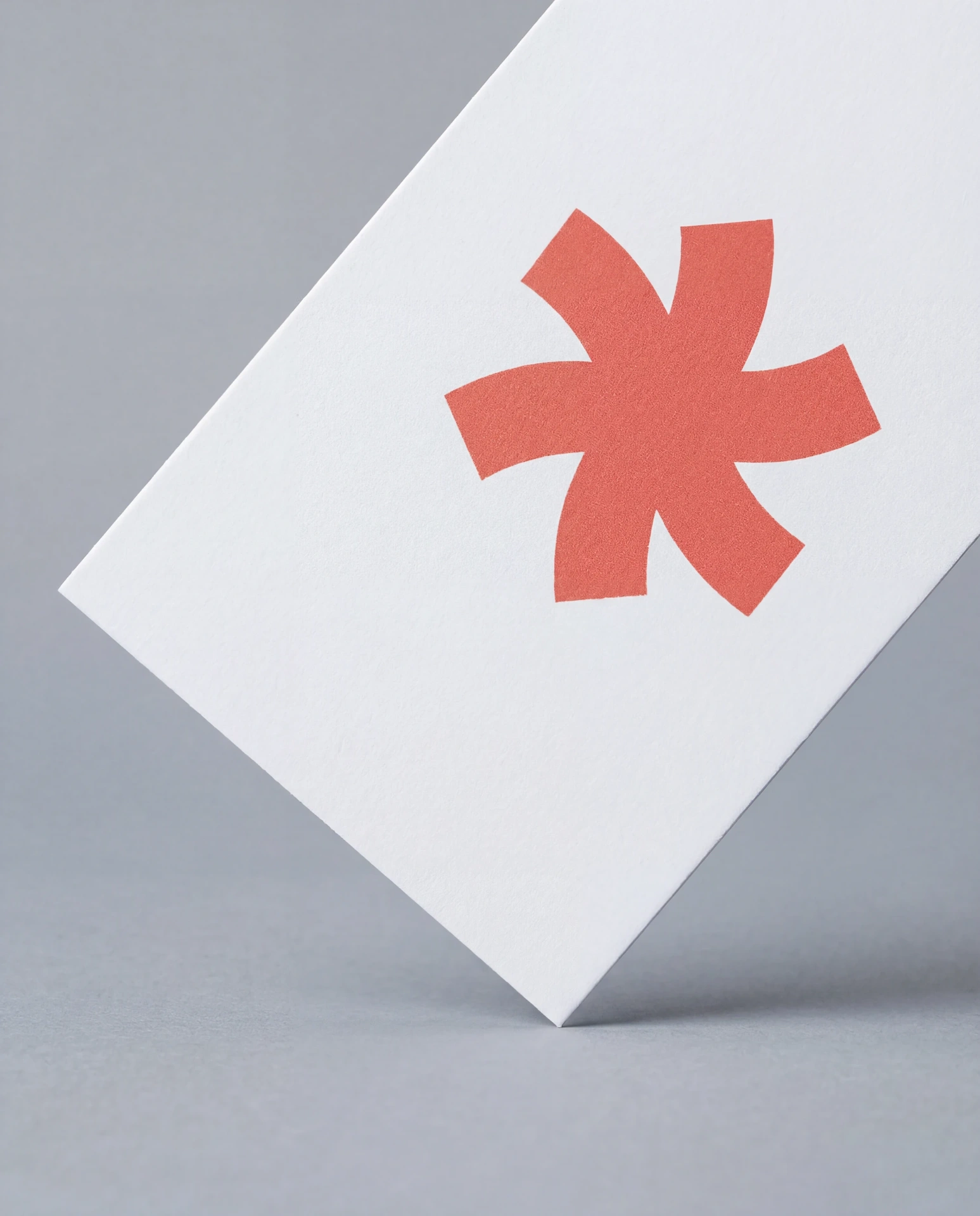
Shop by Finish
Start with a finish.
Foil, emboss, thick stock, die-cut — choose the finish that defines your card.

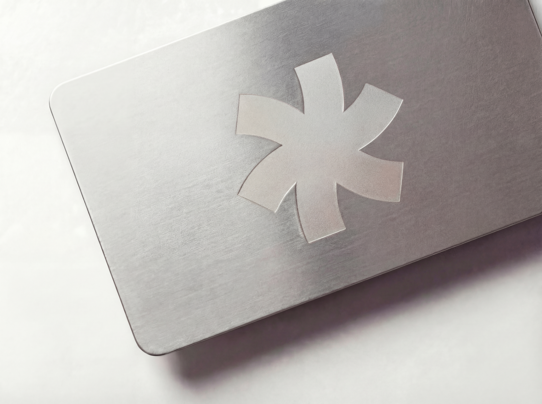
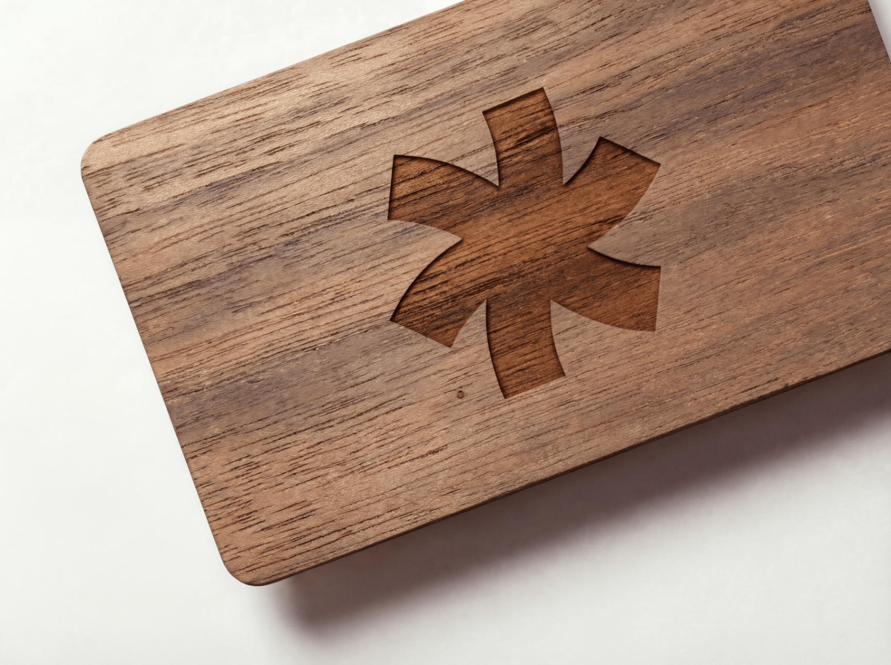
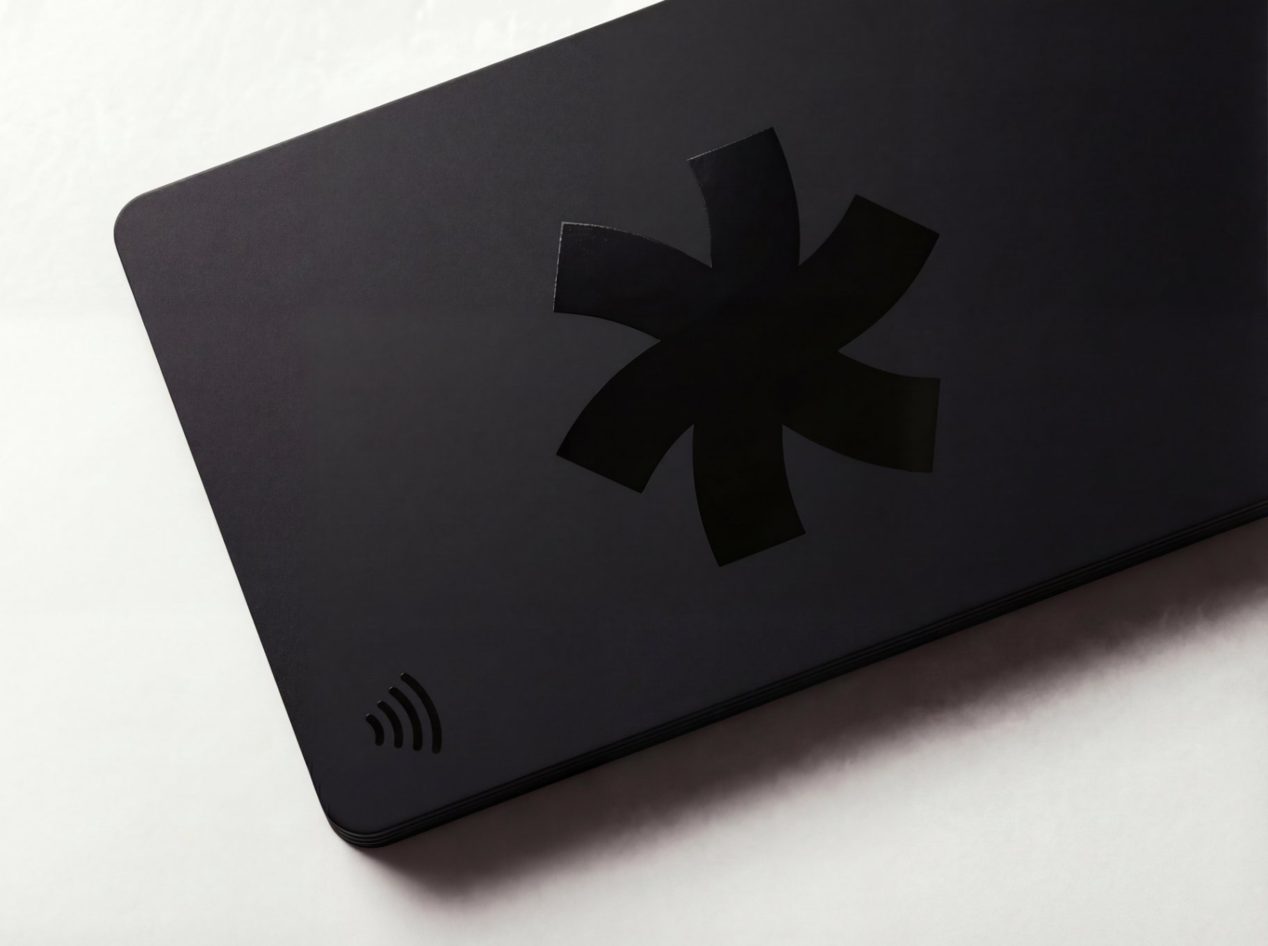
Shop by Material
Or start with a material.
Metal, plastic, wood, smart technology — some statements require a different foundation.

Classic
Just need simple, professional cards?
Not every card needs foil or letterpress. Our classic cards ship in 4 business days.

Not sure where to start?
Open the Studio and design business cards, wedding invitations, and more on premium papers with luxury finishes — foil stamping, embossing, letterpress, edge paint, spot UV. See it before you order.
Open the Studio →No account needed · Free to try · Instant preview