Outdoor Advertising Done Right: 4 Design Tips for the Best Banners
adminShare
Outdoor Advertising Done Right: 4 Design Tips for the Best Banners
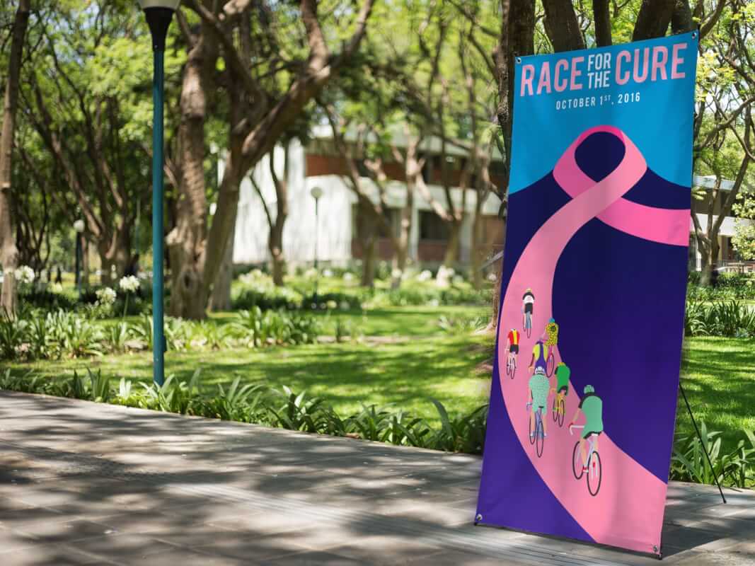
The best banners are meant to stand out. After all, why bother to have banners printed if they're going to be basic? Check out these 4 tips for designing the best outdoor banners.
Do you want to promote your business but don't know where to start? An outdoor banner is a perfect answer. You don't want to just create any banner though.
You want to make one that's going to make people want to walk through your doors.
Here are four design tips that will allow you to make one of the best banners.
1. Chose a Large Text with a Readable Font
You need to use large text on your banner. By doing this, you will ensure that your banner can be read from more than a few feet away.
The size of the text won't matter much if people can't read it due to the font. There are a lot of fonts to chose from but you're going to need to go with a bold sans-serif and not something flamboyant and cursive.
2. Provide a Simple Message
You've probably heard the saying less is more. When it comes to your banner, this is a mindset that you need to have.
The reason for this is you want to get the attention of your audience right away. Nobody has time to read a huge paragraph of text. Keep your message down to a few words at most.
3. Keep Your Brand in Mind
Throughout the creation of your banner make sure you keep your brand in mind. Just because a certain color is your favorite and is really bright, doesn't mean that you should use it.
You want to use colors that really make your brand pop and stand out to people passing by.
4. Chose Appropriate Colors
Speaking of colors, you probably know that different colors cause different emotions in humans. You should consider what kinds of emotions you want to put into your audience.
Red usually causes Anger, passion, excitement, and love. It's a color that appeals to many audiences, but use it in moderation because it's known to make people hungry.
Orange is associated with vitality and happiness. It's not as overpowering as red, it's inviting and energetic.
Yellow invokes feelings of humor, optimism, and energy. Adding in bits of yellow can capture a viewer's attention. Only use a little bit of this color because a lot can be overwhelming
You probably associate green with wealth, health, freshness, and nature. It symbolizes new beginnings and is the color that is the easiest on the eyes.
These are just a few examples of the different emotions colors can cause.
Best Banners Design Tips for Your Business
When it comes to creating the best banners you need something that is going to be eye-catching when someone is within a few feet of it. Choose colors that can invoke the right emotions without being overwhelming to the eyes, and always keep your brand in mind when designing.
If you need a banner designed we've got your back! Visit our shop for all your outdoor banner needs.


