michael caputo visual editor Business Card Design Example
adminShare
Business Card Has the Right Combination of Texture, Color, and Typography
About the Client
Michael Caputo is a visual editor originally from New Jersey, and has since made his mark in different cities around the US. Earning his degree at the Savannah College of Art and Design, he has been focused on harnessing his skills as a filmmaker.
A director and editor, Caputo has spent the last few years working with Whitehouse Post Production in Chicago. He continues to strive for excellence in the craft, and is now continuing his adventure in Los Angeles.
Fancy business card gets texture, color, and typography spot on
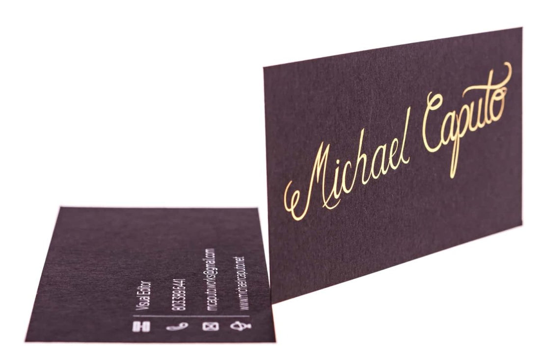
This standard-sized business card features beautiful dark, textured paper. Displayed front and center is the card owner’s name in a fancy gold script. It is also his personal logo, which adds a custom and authentic touch to the whole look. With the combination of the dark background and the logo’s typography, the design is reminiscent of a classic Hollywood title screen.
On the reverse side, Caputo’s contact information is printed sparsely on the bottom-left part. This card is simple but interesting, with its choice of colors and textures.


