Make it Pop! How to Create Contrast in your Graphic Designs
adminShare
When two visual elements in a design are dramatically different, then it is considered to be a contrast. The more the difference, the better will be the contrast.
Making sure that the difference is obvious is key to working with contrast. Your design can have a contrast in value, type, size, color, and other elements.
Contrast can help you to get your message across. But if overdone, it can create a lot of competing elements that may confuse the reader instead of helping.
Now we will discuss some ways in which you can create contrast in your designs,
- Value
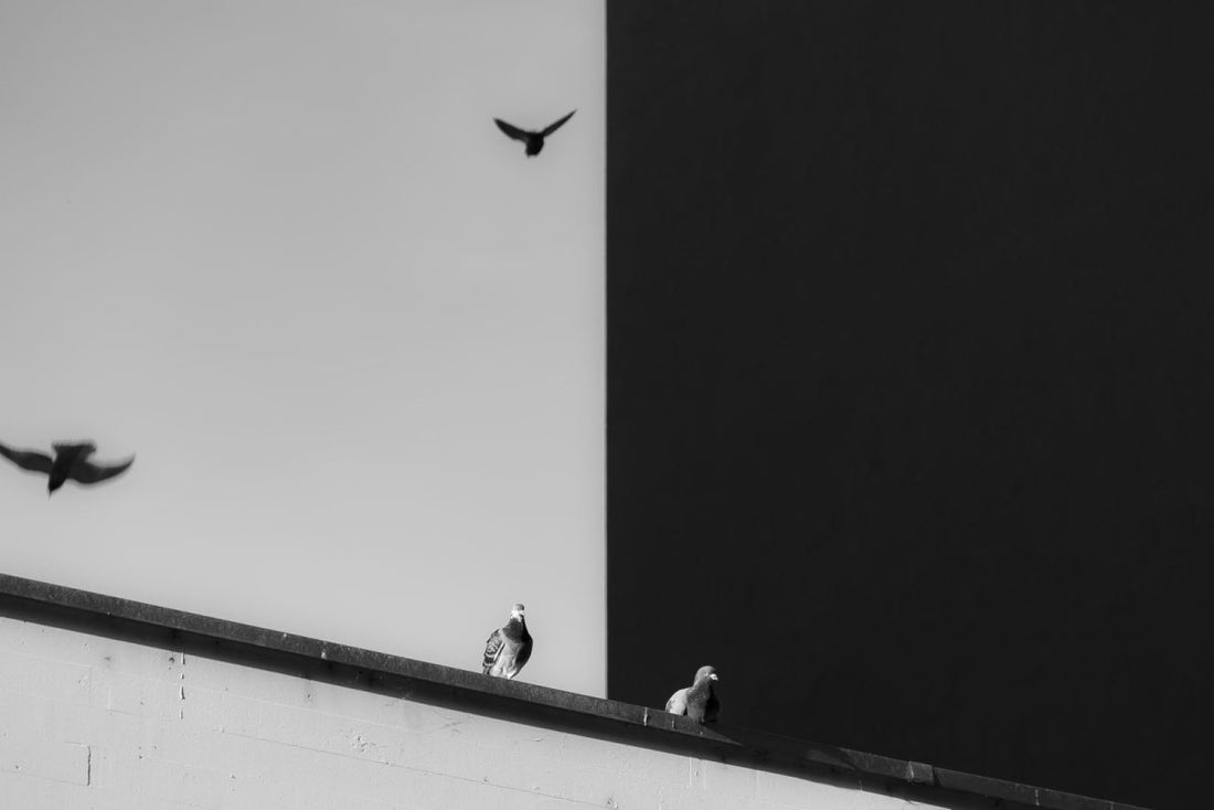
A contrast in value can be created by the relative darkness or lightness of two elements. For instance, the shades of gray, when viewed together, show the contrast in terms of value.
The further apart the values, the better the contrast.
- Color
You can create contrast by using complementary, opposite, and harmonizing colors.
You need to be careful when you are using colors for creating contrast. Harmonizing colors can seem to be washed out if there is not enough difference between them in terms of value.
You need to consider the effect on viewers when you determine the pairs of contrasting colors. For instance, bright blue and bright red contrast but they can cause a strain on the eyes when viewed together.
- Size
One way to bring in size contrast is to place two elements next to each other, which are the same in every aspect other than size.
For instance, you can use small and big images or small and big typefaces. Another way to bring in size contrast is to leave plenty of white space around a small object.
Enlarge the elements you want to emphasize because the viewer’s attention will be drawn to larger items first.
- Typography
You can also add contrast to your designs by playing around with typography. You can use different techniques for this.
You may use different fonts, or you may use italics or bold. You can also add small text with large text. Having text in different colors and values will also help in creating typographic contrast.
You can also play around with spacing and alignment. Using different yet complementary typing styles is another way to create typographic styles.
Using typography elegantly in your designs is an art, and you should practice it for improving your designs. You can start off by learning the principles of combining typefaces and limiting the number of font categories to three or less.
- Other Contrasting Elements
Some other elements which you can use for creating contrast are shape, direction, texture, alignment, and movement.
You need to remember that using a substantial difference is key to contrast.
You can use your imagination and inner creativity for coming up with additional ways of using contrast. You can use irregularly shaped or wide photos to complement tall and skinny columns of text.
You may add an image showing movement among a series of text images. You can also create contrast by adding some color to one element of a black and white photo.


