kathryn polley marketing Business Card Design Example
adminShare
How Earthy Tones Can Add a Touch of Elegance
About the Client
Kathryn Polley is a marketing manager who works at paint company Sherwin-Williams. With close to a decade of experience in the business, Polley has taken several management positions.
She has extensive knowledge of interior design and how it relates to her company's offerings. Tasked to manage lead generation tactics, Polley provides comprehensive product knowledge and information for viable prospects.
She works with both clients and in-training staff to maintain customer satisfaction and brand quality.
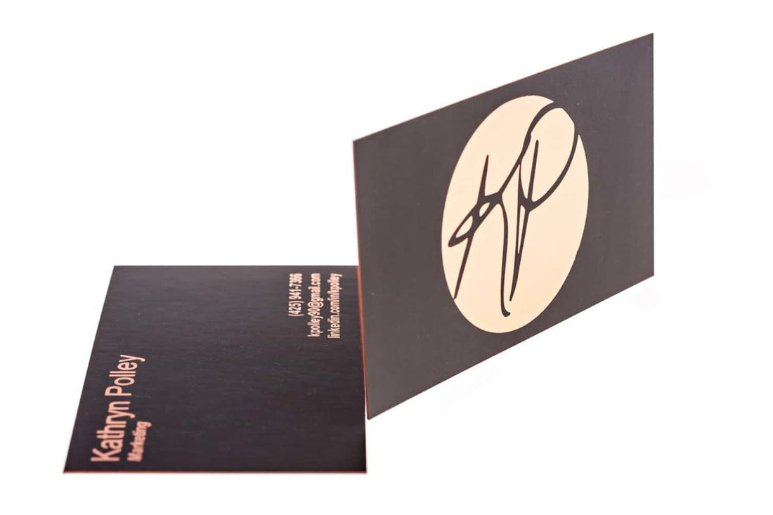
Earthy tones and a quality finish make a card elegant
As a marketer, this client values first impressions. Hence, the business card needed to be clean and professional but also stylish.
One of the key features of this card is the artistic rendering of Polley's initials. The logo is showcased on one side of the card. A solid neutral beige and dark brown background completes the look.
On the other side is the contact information, printed in modern sans serif. The same palette is used on this side.
The semi-glossy, high-quality paper showcases the design well, making the earthy tones pop.


