jenn mede Business Card Design Example
adminShare
Jenn Meade’s Aesthetic Simplicity
Jenn Meade identifies herself as a specialist in digital and print graphic design. Her creative and sumptuous graphic treats are a testament to her ingenuity and skillfulness.
She’s established a solid footing in the corporate world by helping businesses convey their goals vividly and effectively.
I admire her simplistic illustrations that don’t just deem themselves effective but also leave a lasting impression.
According to her, she has a burning desire for creativity ― to craft designs that stand out and turn heads.
She’s always experimenting with new techniques. However, her experimentation is deliberated ― fully thought out― and follows a recipe that has time and again helped her receive widespread acclaim.
There’s no pretense, no extra embellishments or cheap showiness in her designs. With just a few embossments and little lettering, she says all that is needed.
This shows that she’s found her artistic voice ― a treasure that many artists spend their entire lives searching for.
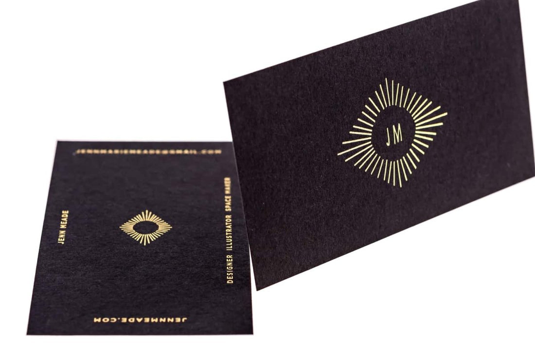
Jennifer Meade, utilizing the full force of her aesthetic simplicity, brings us a design that has an elegant contrast of gold and black.
I absolutely love how cleverly she’s positioned the fine gold lines around the main company logo to make it appear more prominent and visual. Also, the font of the company logo is just the right size for a card with these dimensions.
The size of the lettering on the back of the card has been reduced to fit perfectly across the edges of the rectangular card. There’s no hint of claustrophobia. The card appears spacious and inviting to the observer at first glance.
A good business card doesn’t stuff information. It makes room for it astutely. And Jennifer Meade, by the looks of this design, knows this very well.


