How do I make a billboard design?
adminShare
Designing a Billboard that Sells ― the Ultimate Guide
One aspect that makes billboards an essential marketing tool is a roadside ubiquity. These massive structures are seeded into the ground almost everywhere, from busy traffic signals to the lush green pastors of the countryside. The glances they enjoy ― millions. The potential they possess to garner an audience ― massive.
But the art of making a billboard design that turns heads requires meticulous attention to detail and a methodical strategy.
If you’re new to billboard designing, here’s how you can put your advertising budget to good use.
Effective Billboard Designing Tips
1. Keep it Clear, Concise and to-the-point
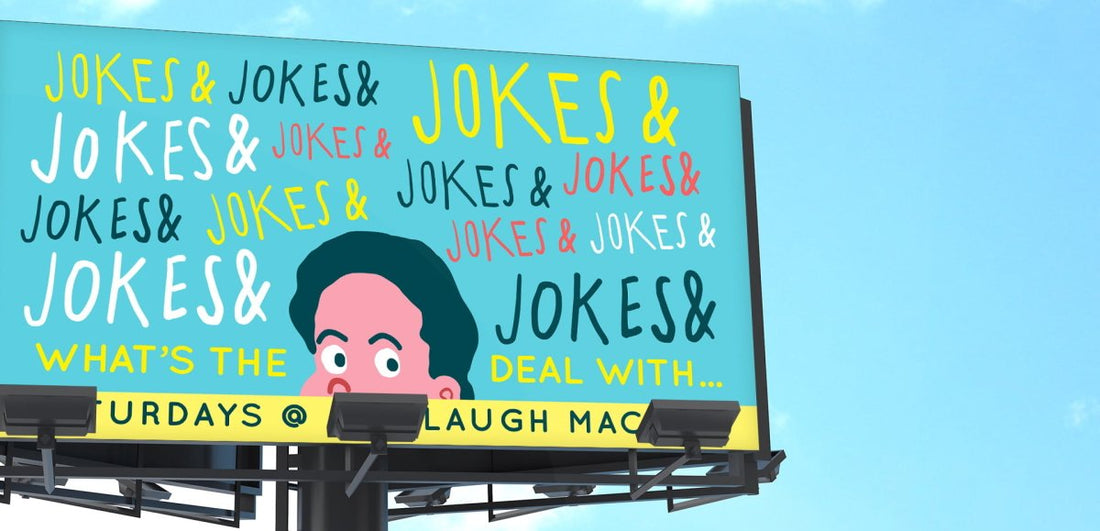
Speeding cars and passersby perched inside them will only have a window of 3 to 5 seconds to view your billboard design. In this limited timeframe, you have to imprint your brand’s message onto their minds.
To accomplish this, keep the text of your billboard severely limited ― 7 words at the very most. And make these 7 words count. Don’t integrate irrelevant and confusing information. Be to-the-point and succinct. Don’t spell out complete sentences. Jargon and industry language is a big NO. “It’s” “The” and other words to make the sentences feel wholesome isn’t advised. Stick to fragmented sentences.
Give your audience a phone number or a website address. Insert a logo or a location to guide travelers to your brand’s front door. Just make sure that everything important is up there and everything unneeded is discarded.
The margin for error is minimal. Make sure you don’t overdo or overcomplicate the design.
2. Choose a Legible and Prominent Font
Your billboard needs to stand erect like a proud king. If it’s not prominent or illegible, even in the slightest, there’s a massive possibility of it missing the mind’s eye of the driver.
Keep the text oversized, neat, legible, and bolded to ensure it is perfectly readable. Remember; the larger the size of the font, the easier it is for the reader to understand.
Don’t hesitate to devise a larger than life billboard design. It might cost a little extra, but it’s going to pay dividends at the end of it all.
3. Pick Bold and Vibrant Colors
A successful billboard design is an epitome of prominence.
And what better way to bring a diamond in the rough to prominence than glittering it with bold colors and images. They are the perfect ingredients to make any design an eye-catching beauty.
4. Go with Powerful Contrasts
Steer clear from cheap contrasts that make the billboard seem tasteless and gauche rather than picturesque and mesmerizing. Colorful and appropriate contrasts will complement your message and give it extra visibility.
5. Select a Single High Quality and Relevant Image
The choice of images is another sensitive matter.
The background should accentuate your images, not downplay them. Make sure it’s simple and only serves to divert attention back to your main visual attractions.
Refrain from using a slew of photos. One large high-quality image is sufficient to get the job done. It will impact a lot more than a heaping mess of a handful of overwhelming and crowded photos.
The surroundings of your billboard hold paramount significance. You have to study the area your billboard is going to be placed in.
6. Strike the Perfect Balance
Billboards are designed to attract drivers, motorists and other mobile audiences. Ironically, this creates an enigmatic situation for the advertiser. He wants people to notice his advertisement, but not to a degree that it causes an accident.
This is why striking that precise balance in the billboard design is extremely important to ensure it isn’t met with harsh criticism of any sort.
7. Focus on Brand Recognition
Advertisers need to understand one important thing about billboard advertising.
Billboards aren’t meant to directly fetch customers.
It’s highly unlikely that an onlooker will dial a number or visit a website plastered onto a roadside billboard. .1% might, but the rest will show total apathy. They will dub such information unworthy of their attention.
The primary purpose of billboard advertising is brand building, not call-to-action. Billboards just don’t have the marketing stature to do the heavy lifting. Understanding this is vital.
My advice: remove the itch to overcrowd your design with phone numbers and social media links and focus on what’s really important.
8. Refrain from Over Smartness
Be outrageous, daring, imaginative, and witty. But most of all make sure people understand you.
A dull and bland billboard will fail miserably. There’s no question about it. People crave ingenuity.
However, remember that over smartness can cost you. You have to grab the attention of your reader, not make him scratch his head.
People are suckers for a straightforward genius that they can understand, not an incomprehensible Einstein.
Complex and intricate designs and messages only serve to puzzle and confound. And in the case of billboards, where there is a terribly restricted time period to get the message across, it’s important to keep things original but simple and straightforward at the same time.
9. Invest in an army of billboards
Most advertising virgins aren’t aware that billboards get Gross Rating points or GRP. Depending upon a variety of factors, such as location, visibility, traffic and size, billboards are assigned a showing score (1-100).
If a billboard receives a showing score of 30, it means that at least 30 percent of the surrounding population is bound to exchange glances with it at least once a day.
So, if you have a single billboard in the area, your chances of reaching your intended audience are considerably lesser than when you have 4 or even 5.
Your goal should be reaching that widely sought 100 GRP, but it’s going to cost you.
RELATED: 8 Essential Things to Consider In Your Billboard Design
10. Be Original and Daring
Fiddle with the geometry of your billboard. Sure, flat design is the tradition. But you can always break tradition. It might actually work to your advantage.
You can opt for a 3D design or go interactive for the sake of involving your audience and even have uplifting and interesting animations integrated. There’s no hard and fast rule to stick to the same old design paradigms. Creativity and thinking outside the box will raise you among the common herd.
Don’t let the opportunity to showcase your creative eye go to waste. You’re an artist, not a trained monkey. Remember that.
11. Choose the Logo Size Wisely
Every advertiser will swear by the rule: Keep the size of the logo bigger.
The reasoning behind this is quite logical. I mean, the bigger the logo, the more attention it garners, right? But, it’s not always advisable to go with an enormous logo. Why?
An oversized logo can steal the limelight from the main message of the brand, the one that’s actually going to convert potential customers. So, make sure you strike a perfect equilibrium between it and the size of the text.
12. Do The Arm's Length Test
Okay, you’ve broken your back, done the heavy lifting, burnt the midnight oil, and the result is a beautiful billboard design. But wait, you’re not quite done yet.
Ask yourself, will people understand the logic behind your billboard? Will it be seen and heard and most-of-all, will it make a mark? How can I make sure?
To answer these questions, print a miniature version of your billboard ― the size of a business card ― and place it on your arm. Does it have all the things it had when it was displayed on your computer screen? If not, it’s time to further process it and make it pop.
Stunning and Effective Billboard Ads that Immerse Audiences
Now that we’re done with the fundamentals of billboard designing, it’s time to shed light on some witty, thought-provoking and exceptionally unique billboard ideas. We’re doing this just to give you an idea as to how professional designers employ the above rules to bewilder and stun audiences.
1. Firefly Billboard Ad

Source: Mohamad Saffiuddin
The shadow of the airplane makes it seem as if it’s been cast from the sky. It’s a perfect example of interacting with your surroundings to accentuate the message of your brand.
2. The Chained Flex

Source: Budeco
To further strengthen the claim of the strong flex, look how wittily the chain suspends down to a children’s swing. This unique design is both comical and thought-provoking and is another fine example of making the best of your physical surroundings.
3. The two sides of men’s hair

Source: Dashing Hub
To drive audiences and to compel them to take prompt action, this design pits a weakness against strength. It plays with the emotions of bald men but at the same time provides them with a means to solve all their sorrows.
I love this billboard design because of its unique format. The flap with the brand message (restore it with hair club) almost seems as if it’s popping out. It’s just so visually prominent.
4. The Razor Sharp Blade

Source: Oddee
The above design is a testament that there are no limitations when it comes to billboard designing. You can tinker with the geometry of your billboard limitlessly to make it stand out and complement your brand philosophy. The reigns of creativity are in your hands.
5. The Popping Steak

Source: CSS Design Awards
Sure, the massive fork aligning with the billboard is an obvious attraction. But, the alluring typography, the bold protruding image of the steak and the choice of color palette should not be overlooked. All of these factors work together to give this design its characteristic prominence.
Conclusion
Billboard designing is a subtle art. You have to cater to every detail, adhere to every foundational rule, and yet break traditions and think outside the box to create a masterpiece worth your investment. Dream big and with a couple of stumbles here and there, you will finally reach your intended goals.
If you are not sure what to do or want any help in designing a billboard that will help you convey the message to your audience, let us know. Our Billboard design services will always cater to your needs.


