house of matriarch perfume Business Card Design Example
adminShare
The House of Matriarch proclaims on its website that beauty will save the world.
And how is this high-end Luxury Perfume dispensary contributing to the beauty of the cosmos? Simple: by encapsulating it in little bottles of perfume.
According to Matriarch, fragrance is a stimulant that draws your mind into a world teeming with emotion and memory. To Matriarch, fragrance is dancing smoke, a passing experience that changes its effects with the passing of time.
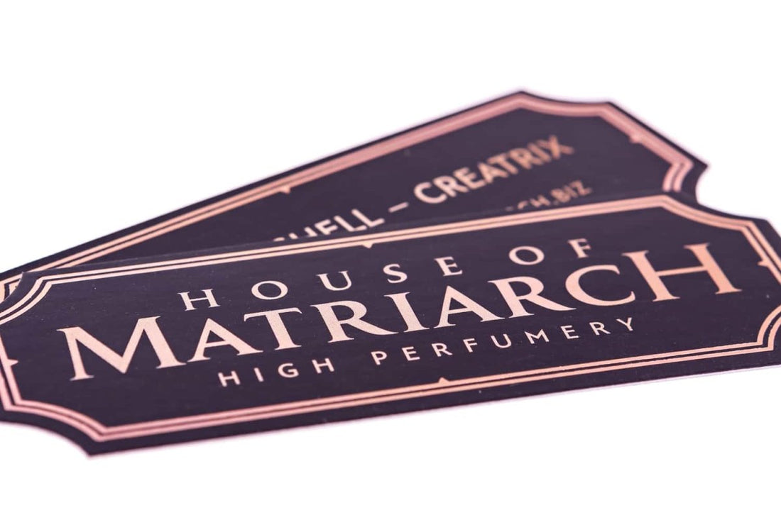
For a business that thinks of its products in terms of such poetic-intensity, a simple rectangular or square business card isn’t going to do any justice.
That is why this die-cut business card has been made with a geometrical uniqueness – an asymmetry that merits its inclusion in a collection of rare gems.
The unique shape of this card gives Matriarch extra recognition. As it strikingly differs from traditional business cards, it stands on a league of its own, and most importantly against the competition.
If its shape wasn’t this unique, it would’ve been just like any other card; there would be nothing special about it or the business it is representing.
Lastly, behold the splendor of the royal and majestically shining font, which is absolutely perfect for portraying the image of a luxury business such as Matriarch.
I also couldn’t help but notice the double-lined margins. They put a strong emphasis on the shape of the card, and give it added prominence.


