greenwood photography Business Card Design Example
adminShare
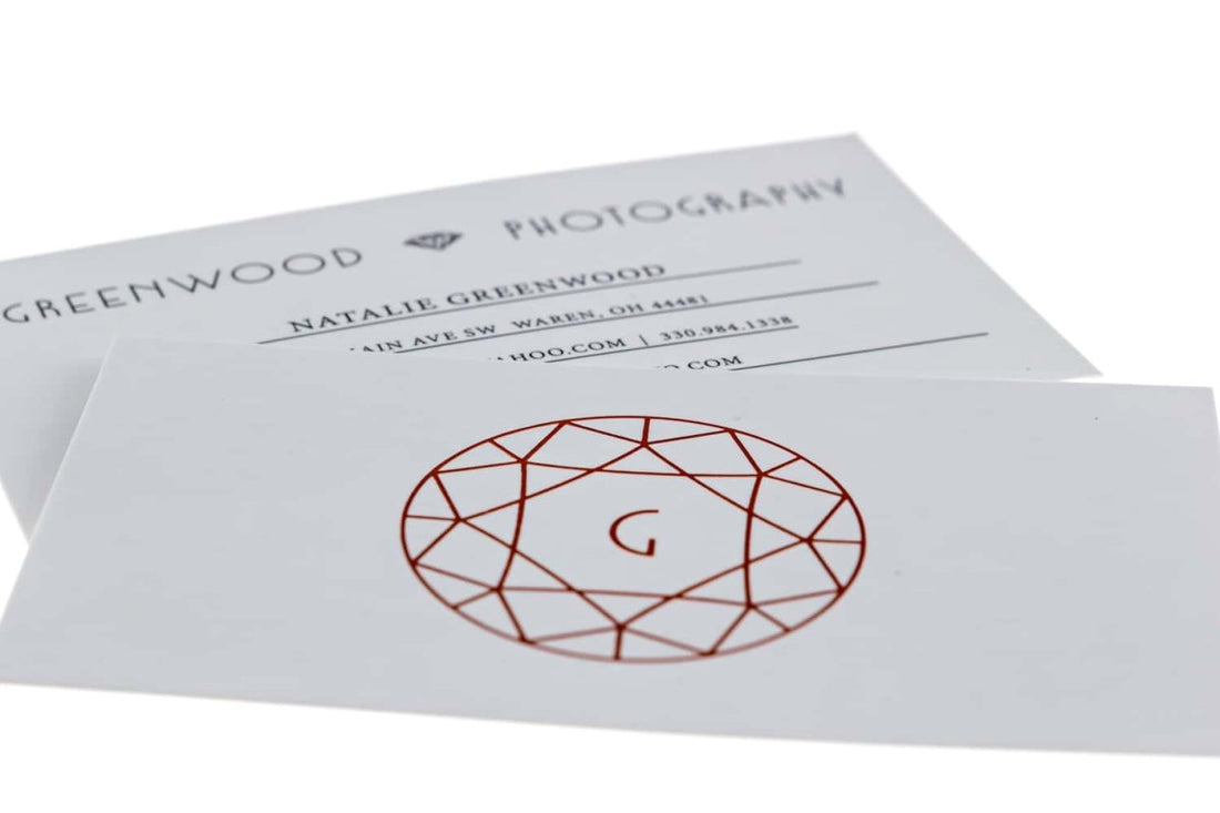
Faded White Elegance
“The success of a business card hinges upon its visual appeal.” This is a gross misconception that lands 90% of business cards in trash cans.
Look at the above card. Has the designer sprinkled flashy colors and made it excessively graphic? No! He knows that an effective business card is the one that gives the company’s message the limelight. Unnecessary and extravagant images and design details only serve to wane the reader’s attention span.
I love how old-school the backdrop of this card is – a greyish white that goes hands in glove with the company’s red logo in the center. This card is another example of how to effectively use white space to direct the reader’s focus to the main company information.
The contact details are positioned at the back of the card. The font is legible and neat.
One thing you should note is that the designer has underlined important information like the photographer’s name and his contacts to emphasize their importance.
On first look, there’s nothing special about this card ― it’s not a marvel of creative genius. But it’s effective and does what it sets out to ― get potential customers to get in touch with the business in question.


