foze marketing Business Card Design Example
adminShare
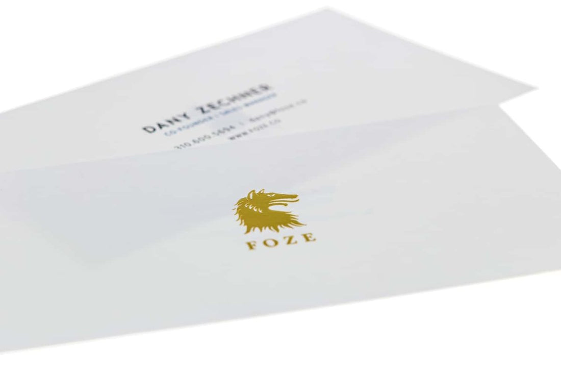
This milky white card is for businesses who don’t want to compromise on professionalism and trust, at any cost. It is a striking example of a minimalistic card that whispers in its reader's ears a convincing sales pitch, without coming off as a muckety-muck.
From the looks of it, it seems like any other unimaginative, dull and glib business card. But there’s a lot going on behind the curtains. The acres of white space put extra exposure on the central logo and name of the company. It sacrifices its limelight for the good of the business it is representing.
I also love cards that have a gold and white contrast. The white backdrop with the golden typeface and imagery give off a luxurious feel and look.
The contact details on the back of the card are legible, neat and induce a solid call-to-action. The designer has stuck to a single typeface, which is great because it lays the brickwork for brand recognition in the long run. It also makes the card look exceptionally slick and neat.
For a business that’s looking to address its clientele in a professional and serious manner and with an upstanding decorum, this business card will serve as an excellent touchstone.


