cypress science Business Card Design Example
adminShare
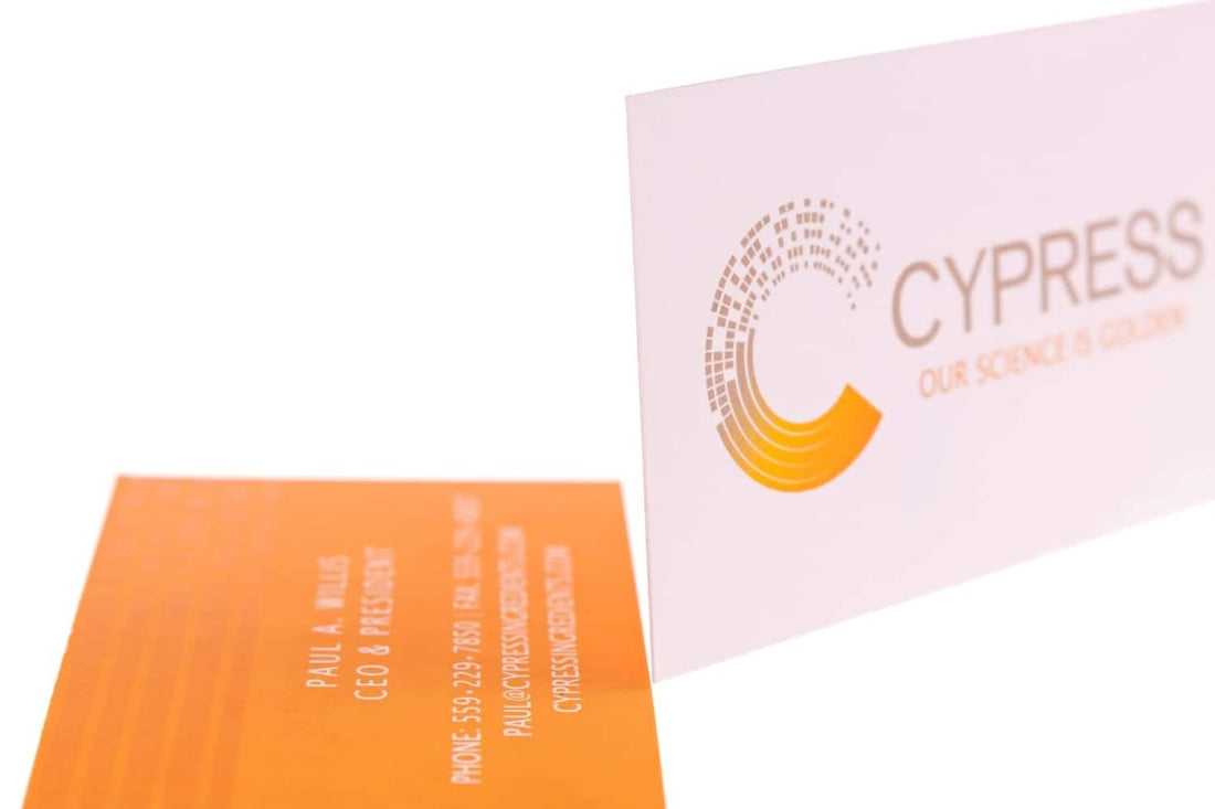
Simplistic, minimalist business cards such as the one shown above echo the clean, a professional and modern identity of the brands they represent (Magdalena Trzciałkowska).
They are minimalist in the sense that their surface texture, shape, orientation, typography and colors are kept on the down-low. They are professional but simple. They are bright but quiet. They are conventional but neat.
The above fact, about how such minimalist cards represent their owners’ minimalist style, can be further built upon by the way the business logo is represented on this card. Not too over the line, nor too subtle. A C just as the initial of the brand name is.
The combination of typography with the backdrop orange hew is what caught my attention the most from this card.
Bright colors like orange, if used for thick and heavy typographies, can seem too flashy, like they were overdoing the design.
But in this particular card, not just the perfect tone of orange has been used but the thin font in front of is convenient and aesthetic, too.
This card is quite conventional. It contains the business logo and name on the front side, whereas the rest of the business information is present on the back.
This allows the designer space to relax, knowing he/she has doesn’t have to worry about cramming everything on one side.


