The Most Easily Readable Fonts for Web and Print
adminShare
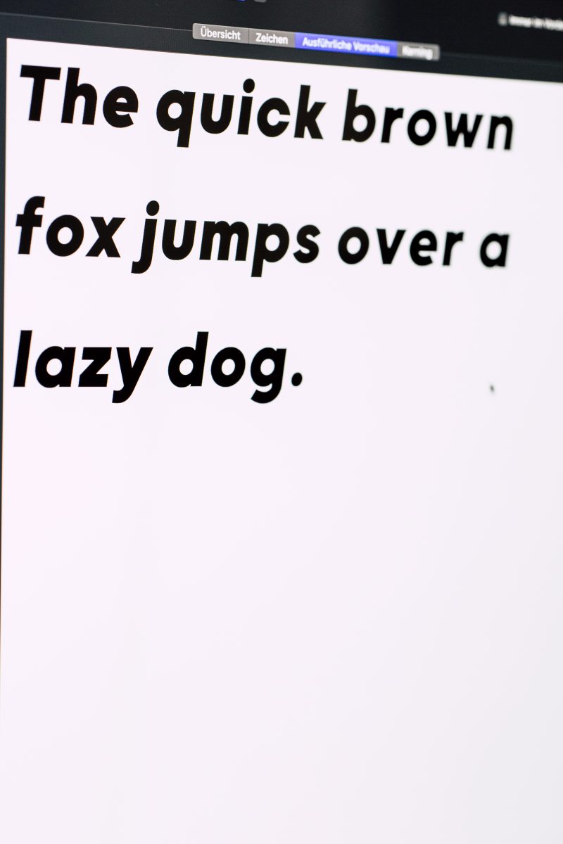
The best 12 fonts that are easier to read
A more in-depth look at some of the best fonts available on the market.
Looking for the right font might seem like a simple task and one that does not require a lot of thoughtfulness. However, the best designers out there spend a considerable amount of time trying to select the very best font for what they are working on.
Why are fonts so important?
The reason why they are so vital to any design project is that they are an aesthetic element; they are also essential for people to be able to identify information and read the content seamlessly. If the font chosen is too anemic or dull, the design might look unexciting.
By contrast, if the text is too ornate, you might risk making the content hard to read. To help you make a decision, we carefully selected a list of 12 fonts, which are considered staples in the industry.
They are easy to read, while also retaining a lot of style and timelessness, making them perfect for any design.
1) Georgia

This is one of the most popular serif fonts out there. For those who may not know, a serif design is more decorative, with letters adorned by small lines and other appointments. Although this lettering is a bit more detailed than other options, it is still very reader-friendly, and an excellent choice for websites.
2) Helvetica

Among the most well-known fonts out there, this design is a classic with decades-old roots. This is a sans-serif font, and it is very popular because of its increased readability and ease-of-use.
3) Open Sans

Another popular sans-serif option, this particular font, was designed to increase legibility. There is more space between characters, and it is well-suited to digital publications, as well as printed documents alike.
4) Verdana

This font is exceptionally sought-after for its heightened readability rates, and what's special about it is that it was explicitly conceived for computer screens. Because of this, Verdana is a sans-serif font.
5) Rooney

This customized font is great for branding. It has a strong personality, and it excels at headlines, logos, and other applications. It has a round look, which adds warmth and familiarity to any brand.
6) Karla

This is a great choice for clarity. Its thin, evenly spaced characters are perfect for online content, but they also look great when printed out.
7) Roboto

This is a relatively new font, which came to be for Android use. However, it quickly made its way into many other applications, due to its elegant, yet bright and understated style.
8) Arial

Arial is considered a standard in the industry, and although some people might think that this offering is a little outdated, it still works wonders for its clear, punchy, and readable style.
9) Neue

This font has a unique history, and it feels like one of those iconic Bauhaus designs that defined the innovative period of the 1920s design explosion.
10) Tisa

This is a relatively new font, although it has become somewhat of a modern staple when it comes to modern graphic design. The spacing of the characters is excellent, which means that it provides high rates of legibility, even at smaller sizes. This font is available in two variants: serif or non-serif. The two choices make for a flexible option.
11) Montserrat

A bonafide modern classic, this font has a geometric look, and it is a sans-serif design. This typeface owes much to the iconic looks of street signs found in the Buenos Aires neighborhood by the same name.
12) Quicksand

Last but not least, this particular font was created to meet the requirements of an increasingly popular market: mobile users. Content is not easy to read on small screens if the font is not right. Quicksand was conceived with lower resolutions and small screens in mind, making the experience more seamless.
In conclusion, there are many different font options out there.
This article is barely scratching the surface! There are hundreds and hundreds of text fonts and typefaces on the market.
Many of them are available for free or as stock features on your computer. It's up to you to determine which one would fit your needs for any given project.
If you want to make sure that you get it right from the start, learning more about fonts can be very useful.
Learn how to recognize different font styles and find out more about their pros and cons, making each option perfect for a specific scenario.
There's no right or wrong choice.
It is about figuring out what's more appropriate for what you're looking to accomplish.


