Working on a New Project? Here are a Few Sure-Shot Font Pairs
adminShare
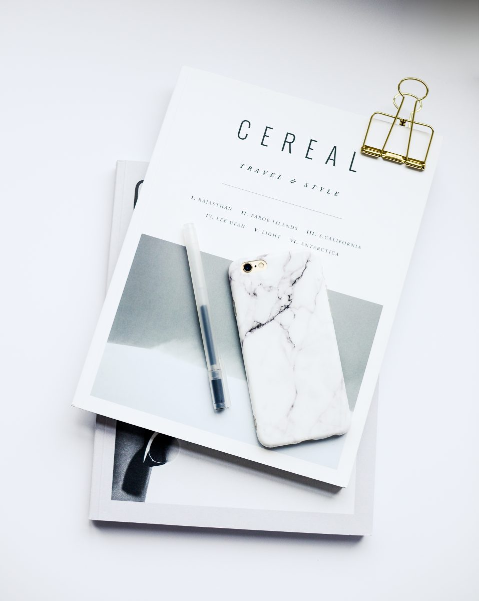
[caption id="attachment_172608" align="alignnone" width="300"] Source: https://99designs.com/blog/tips/text-layout/[/caption]
If you thought mixing and matching clothes in your wardrobe is a hassle, wait till you attempt pairing the right font combinations together. No, wait! We aren’t trying to leave you traumatized for life, all we’re saying is that choosing an outfit will seem like a cakewalk now that you know what picking the best font pairs can do to you. That is if you don’t read on further about the best font pairs to try for your next design project.
When it comes to marketing the outdoors
The best fonts that leave a good impression are thick and bold ones. They are ideal for striking slogans and words.
 Source: https://www.1001fonts.com/mr-dafoe-font.html[/caption]
Pro tip? Titling the font can actually add a more inviting vibe to your design.
Adding sophistication with your fonts
You can branch out and add hints of character to your design to bring out a certain kind of sophistication in your fonts.
 Source: https://www.1001fonts.com/kite-one-font.html[/caption]
Slanted and italicized fonts are great at accentuating your main point. Using spaces between letters also helps to work wonders.
Fonts that come with a friendly feel
The best font pairs to try for your next design project are obviously the ones that give off a friendly vibe.
 Source: https://www.1001fonts.com/yellowtail-font.html[/caption]
It’s the perfect balance for a modern yet traditional look and feel.
The best font pairs to try for your next design project are the ones that stand out even as they blend in. We’re sure you can incorporate both these elements from the tips we just put down.
A collection of great CSS tools and resources can be found at html-css-js.com: code beautifier, cheat sheet, style generators, useful links etc.
 Source: https://99designs.com/blog/tips/text-layout/[/caption]
If you thought mixing and matching clothes in your wardrobe is a hassle, wait till you attempt pairing the right font combinations together. No, wait! We aren’t trying to leave you traumatized for life, all we’re saying is that choosing an outfit will seem like a cakewalk now that you know what picking the best font pairs can do to you. That is if you don’t read on further about the best font pairs to try for your next design project.
When it comes to marketing the outdoors
The best fonts that leave a good impression are thick and bold ones. They are ideal for striking slogans and words.
- Alfa Slab Serif works wonders for digital marketing
- Nixie One is a thinner serif font which wonderfully puts emphasis on thicker fonts
- Roberto Condensed in bold is tall and thick
- Raleway comes with a versatility that is easy to decipher
- Mr. Da Foe has a playfulness that gives the impression that it is the life of the party
 Source: https://www.1001fonts.com/mr-dafoe-font.html[/caption]
Pro tip? Titling the font can actually add a more inviting vibe to your design.
Adding sophistication with your fonts
You can branch out and add hints of character to your design to bring out a certain kind of sophistication in your fonts.
- Quattrocento gives your design that added flair and sophistication
- Pinyon Script is the ideal accompaniment as it works as a calligraphy inspired script font
- Roboto Condensed can be used in capitals with spaces between each letter.
- Kite One is a font that looks slanted naturally
 Source: https://www.1001fonts.com/kite-one-font.html[/caption]
Slanted and italicized fonts are great at accentuating your main point. Using spaces between letters also helps to work wonders.
Fonts that come with a friendly feel
The best font pairs to try for your next design project are obviously the ones that give off a friendly vibe.
- Megrim and Satisfy contrast each other perfectly with the lines and curves in both fonts
- Megrim gives off a fun display font with quirky lines and accents
- Satisfy is a script font that looks intriguing with its curves and loops
- Raleway is a modern, fuss-free font with classy accents
- Yellowtail is a playful script with sharp angles
 Source: https://www.1001fonts.com/yellowtail-font.html[/caption]
It’s the perfect balance for a modern yet traditional look and feel.
The best font pairs to try for your next design project are the ones that stand out even as they blend in. We’re sure you can incorporate both these elements from the tips we just put down.
A collection of great CSS tools and resources can be found at html-css-js.com: code beautifier, cheat sheet, style generators, useful links etc.


