Spot Color or Process Color? Why You Should Choose One Over The Other
adminWith just about the whole world going digital, print marketing may seem like it’s taking a back seat. But experts say there’s now a growing demand for print media, and that the constant bombardment of online ads may well be driving this resurgence.
With print marketing, there are numerous design decisions involved, but some of the most important involve the colors you use. In particular, should you use spot color or process color printing to get the best results?
In order to make the right choice for your marketing material, you need to know exactly what these printing types are and when one or the other is the best option.
Spot the Difference
Both spot and process colors are applied via offset printing. This means that the ink is transferred from the printing plate to rubber rollers or a rubber blanket and from there onto the final material’s surface. The metal plate never makes contact with the surface of the finished, printed product.

Process coloring is basically the Pointillism painting technique on steroids. You might also have seen it referred to as four-color or CMYK, which all refer to the four basic colors that are used –
- Cyan (C)
- Magenta (M)
- Yellow (Y)
- Black (K)
When surfaces are printed with dots in these colors the human eye can’t separate the different colored dots and sees a composite tone instead.
The dots are spaced out differently and are present in various ratios and sizes. With so many possible combinations, a wide array of colors (as seen by human eyes) can be created.
The Cyan, Magenta, Yellow, and Black dot arrays are each transferred to separate rubber rollers or blankets, and then printed one by one onto the same area. This step-by-step process creates the final image.
In CMYK coloring the mixing of the pure tones happens after the actual printing.
Spot color is the exact opposite of that.
Just like you may have mixed red and blue poster paint to make purple when you were in elementary school, spot coloring - also called solid coloring- is mixed from a palette of basic tones.
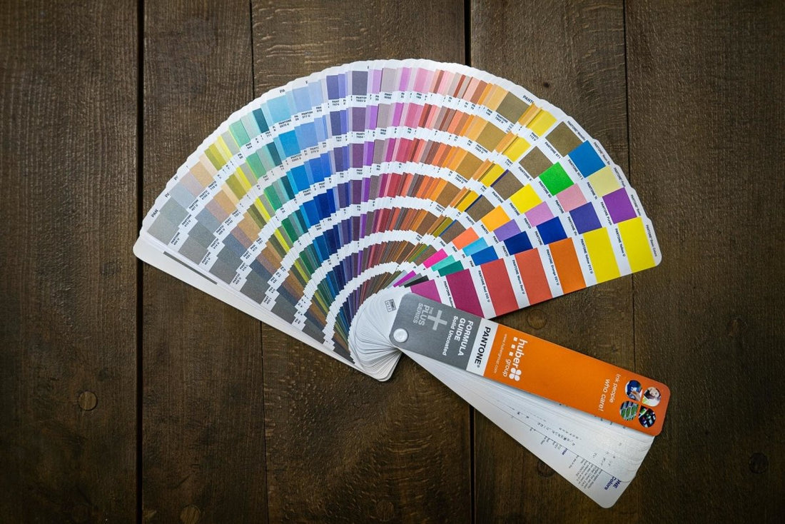
The finished mixed color, or the original basic shade is applied as a solid block of ink. Each color requires a separate printing plate, so if you’re using more than four hues it can get a lot more expensive than CMYK coloring. The most widely used technology is the PANTONE MATCHING SYSTEM® which uses 18 basic colors to mix unique tones.

The unique mixing formulations were all developed by Pantone LLC. This New Jersey-headquartered company started out as a commercial printing company and is now best-known for its branded Matching System (PMS). The PMS allows printers to color-match specific shades during production regardless of the equipment used or the material the ink is being applied to.
Quality control and precision are ensured by Pantone licensing and regulating all manufacturers who sell PMS ink. The ink companies are required to submit samples of all 18 basic colors on an annual basis. Pantone must then approve them in order for a company to retain its license. They should also buy a Formula Guide, which shows the colors and formulations for all Pantone’s hues, of which there are almost 2000.
Since the shades in the Formula Guide can yellow over time, Pantone recommends they are replaced every year. When a manufacturer has a pristine Guide and an approved basic color palette, printers can order specific formulations directly from them or buy the basic inks and mix up the desired tones themselves.
Making The Right Color Choice
Knowing when to use spot color and when to use process color can be the difference between a good end product and a great one.
When Spot Is Tops:
If a company’s trademark tone is inextricably linked with its branding – think Coca-Cola red, Tiffany’s blue, and Home Depot orange – you’ll definitely need to use a solid color. The same is true if you need special ink effects, such as metallic or fluorescent finishes.
If you’re printing customized koozies or company shirts you’ll probably want to go for spot colors too. They remain consistent across different media, so you’ll get the same color on the logo when it’s on your koozies, and when it’s in a magazine, a billboard, or on any other material. Since they provide more even coverage, spot colors are also a better option if the area being printed is very large.
When Process Is Prime:
Process colors are recommended when your budget is limited. Or, if the final image contains lots of different colors that would be time-consuming and use an excessive amount of plates to spot print.

As a designer, you should also note that CMYK and solid printing are not mutually exclusive; you’re not limited to one or the other.
For instance, if an image has very detailed areas as well as large spaces of a single shade, process color would be best for the former, and spot color would work well for the latter. White is a classic example of why being able to blend the technologies is so valuable; it’s outside the CMYK spectrum but is vital for printing on any clear substrate materials.
(Color) Bridging the Gap
Useful as combining process and solid coloring can be, it might not always be possible or cost-effective.
That’s where Extended Color Gamut (ECG) printing comes in.
While ECG is not a new concept it’s only really taken off and become widespread in the last few years. The premise is that by adding new base inks to traditional CMYK technology, the color gamut is increased.

The base inks that Pantone has added are Orange, Green, and Violet (collectively known as OGV). If a spot color is desired where process color printing is being used, you can check to see what it will look like if printing in CMYK or in ECG (which is CMYK + OGV).
Pantone’s EXTENDED GAMUT Coated Guide and COLOR BRIDGE® guide allows you to check what the result would be and decide if you are happy to use the CMYK or ECG equivalent, or if the original solid color is worth the extra cost and effort.
Paint the Town CMYK 0,88,85,7
Like everything else in design, the printing decisions that you make will depend on your project specs. You need to consider materials, run size, budget, and the complexity of the images you’re using, among other factors.
Process and spot printing are both very effective in their own way – it’s up to you to use them properly and get maximum results.


