mike sulick designer illustrator Business Card Design Example
adminShare
Edgy Design Captures Client’s Individual Style
About the Client
Mike Sulick is a professional print and web designer and illustrator. Currently a graphic designer at Fanbrandz, he has experience uniting typography, color, and graphic illustrations to create stunning packaging, posters, and other print and digital visual media content. While pursuing his BFA in Graphic Design at Montclair State University in 2012, he received the MSU Excellence award for Graphic Design.
His work at Fanbrandz enables him to design and develop franchise branding materials and style guides. Projects include those for the National Hockey League, Major League Baseball, and other sports leagues. His work is instrumental to the company receiving three CLIO awards for these branding programs and identities.
Edgy Design Celebrates Individuality
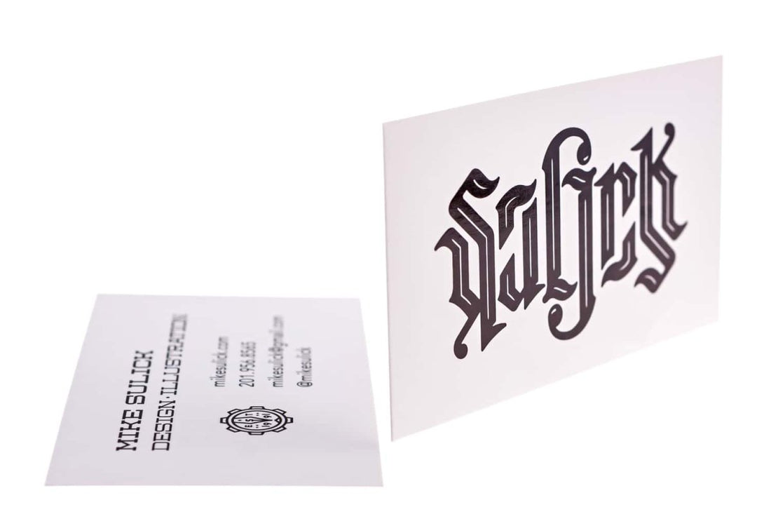
This business card uses a plain white background, but this is intentional as you can focus your eyes on the name prominently displayed. The intricate blackletter-inspired typography reads the name “Sulick” and is showcased front and center. It’s also an ambigram, so the name can still be read when the card is upside down. Meanwhile, on the opposite side of the card are the name and important information about the cardholder. A slab serif font is used on the name and profession, while the rest of the details use sans serif. There’s also a circular logo placed on the left side of the card. Each design choice reflects the card owner’s flair for the unexpected.


