Letterpress Design: 8 Tips for Success
admin
Like carving the most delicate art, designing a letterpress requires meticulous attention to detail. You need to tailor the design to match the distinctive inking and graphic themes letterpresses are meant for.
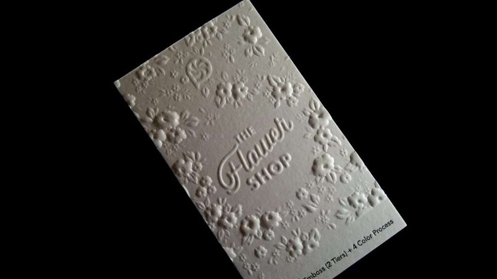
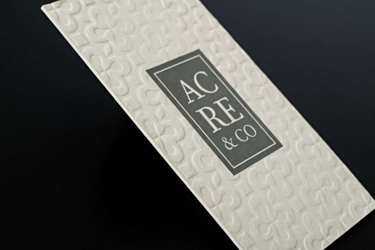
Letterpress is an ancient art form that has roots dating back to the 16th century. Though initially limited to metal and wood engravings, modern letterpress design has come a long way and opened a whole host of new possibilities with the advent of photopolymer plates. The tactile quality that a modern letterpress promises to provide is not possible with traditional printing methods.
Despite the modern letterpress being synonymous with stunning digital craftsmanship, there are some tips and strategies you need to keep in mind to make your letterpress come out as intended. These include:
- See everything in black and white.
This doesn’t mean you shouldn’t print in color. Only the artwork you will transform into a printing plate will need to be in black and white.
You can create the artwork either through the traditional method, on a piece of white paper with a pen, or you can use Photoshop or illustrator.
Whatever option you choose, you can’t have blended gradations. For shading, you’ll have to think of dark and light the old-fashioned way. As an example, you can cross-hatch lines like on dollar bills to create shades.

- Think in layers
Letterpress and other traditional printing methods are incapable of printing all the colors at the same time. They don’t have the same functionality as digital printers. Each color will have its own separate black and white layer, which you’ll turn into a printing plate.
Furthermore, you will have to run each layer or color separately through a printing press. Crop marks may help in this regard.
That said, transitioning from one color to another in letterpress doubles the work, which increases printing costs. That is why using limited colors in letterpress to produce a great design is an art in itself. Some designers overlap two transparent colors to make a new color.

- Dark on light
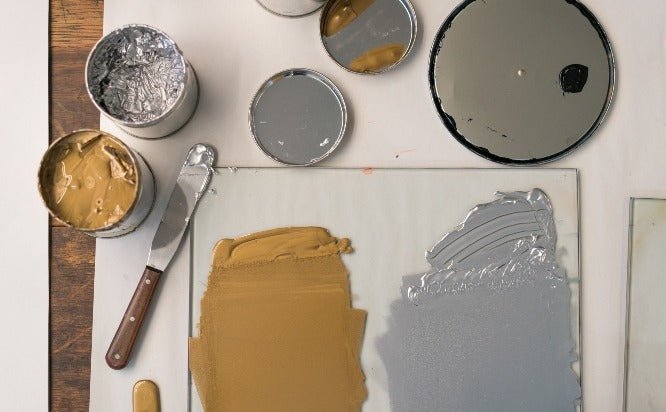
Letterpress press ink is translucent in nature. If you print a light color on a darker one, it won’t show. That is why designers always print dark in on light paper.
Imagine coloring a dark wall with a light color. The lighter color will show eventually but probably after five or six coats, which will take a hit on your budget.
The best combination for letterpress is a darker colored ink with a lighter colored paper stock. However, if you want to engrave or foil, then light ink on dark paper could work.

- Work With Limited Size
Most letterpress printers use platen presses. Platen presses open and close like removable teeth and can’t print any area exceeding 5 x 7 inches.
Some lavish printers use flatbed presses. Flatbed presses allow the paper to roll across the printing plate and allow for more printing, up to 12x18 inches. These are the largest dimensions you can print. There are some larger letterpresses, but they are scarce and may cost you a fortune.
- Not too thick
For printing large opaque areas of color, ditch letterpress and go with screen printing. It’s close to impossible to apply pressure or ink over a large surface with letterpress.
And even if you somehow manage to accomplish this, the end product will most likely come out splotchy. Sometimes, this works, especially when you are going for a classic or handmade look. But, just have a clear vision of what you want before you start.
- Overprinting & Trapping
You can easily overprint colors in letterpress printing to create the desired effect. But, you need to know the third color you want to overprint. There are limited number of impressions so you have to keep that in mind. Darker colored inks may require additional impressions — more than two or three passes at the very least whereas for lighter colored inks, a single pass would suffice.
You can also do trapping — the process of aligning colors adjacently, with little to no overprint, — maintaining the original colors in the process.
- Keep Things Even
It's essential for smooth and balanced printing to keep lines and shapes in a given plate, color, or layer consistent throughout, especially in size and thickness.
If you print a rectangular type to a square, spacious kind, the square one will look out of place and under inked, or the rectangular type will look over inked or messy. Keep things in moderation and try to strike a balance to keep things looking geometrically even.
- Introduce other Techniques
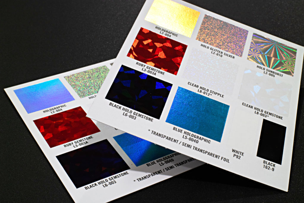
Despite a letterpress’s unflinching beauty, it has its limitations. So, why limit yourself? Why not complement a letterpress with another printing technique to get the best of both worlds? If metallic ink doesn’t work in letterpress, why not involve foil stamping in the process to cut the deficit? With foil stamping, you can inscribe an actual metal piece into the paper stock.


