Intended Wedding Photography Business Card Design Example
adminShare
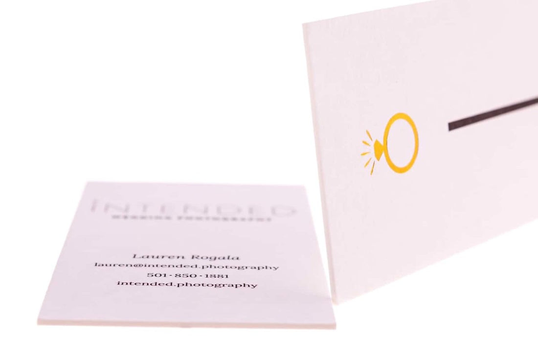
A Feast of Simplicity
The designer of this card needs to give lessons in creative design. On first glance, this card doesn’t seem much of a looker, but underneath its simplicity and plainness is hidden its reason for success.
Firstly, let’s talk about the front of the card. The information about the artist and the company is non-existent. All you have is a simple logo and a lot of empty space. Why is that?
Designers who stuff a lot of information make a huge mistake. An excess of information and aesthetic detail leaves the reader confused and overwhelmed.
That’s why the designer has kept the frontispiece of this card purposefully minimalistic. It’s basic business card psychology.
Also one of the reasons why the designer hasn’t revealed much on the front of the card is because he wants the reader to search for more. He wants to arouse his curiosity. He wants him to ask this question “Who does this card represent?”
And when a designer succeeds in arousing the curiosity of the reader, he wins! The card becomes an unforgettable memory. Isn’t that what all business cards aspire to be?
Voila! As soon as the observer turns the card, all is laid bare to him. The details of the artist and his company, his email, and other details are all there for the taking.
For a card this simple, the choice of font is a no-brainer. It’s professional and has just the right spacing between the words.
The one thing I don’t appreciate much about the card is the choice of two different fonts. Two varying fonts on the same card leave a negative effect on the reader. They make the card seem rather cluttered.


