if creative marketing Business Card Design Example
adminShare
Creative Boldness
Ivan Freaner is an award-winning and critically acclaimed design studio that helps bring creative joy to corporate bigwigs, small digital agencies and emerging start-ups.
Ivan Freaner believes that in order for a company to grow and succeed, it must visually represent itself in a way that excites its clientele.
In an age, where the bulk of the audience is teenagers with Instagram and Tumblr accounts, places where digital art and photography takes precedence over bland and empty texts, I believe the mission of IF is quite understandable.
One of the reasons why IF has achieved high praise in the digital world is because it doesn’t take on a lot of clients.
It’s a small design company, with the focus to direct its resources and expertise to a small list of exclusive clients. This business strategy ensures that quality never takes the backseat.
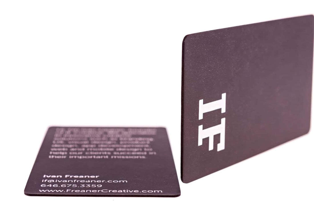
For a company that helps businesses transition from the vintage years of the 90s to the futuristic world of digital art, this business card design is a clever choice.
The round edges are a refreshing change from the overly used pointy corners. Sometimes, the eyes get tired of seeing the same standard sharp edges.
The front of the card is aesthetically simple and defines the mood. The Dark purple background is energetic and bold. It’s not in any way a dull color which saps the concentration of the observer.
Also, the choice of the font is commendable. Notice how big its size is when it is used to type the company name and how it significantly reduces in size when it’s portraying secondary information on the back of the card.
This subtle change in size puts in place a pecking order. The company name is of primary importance, the contact details secondary, and at the bottom of the food chain is the rest of the information.
I can’t help but admire the card maker’s awareness of the reader’s psychology.


