This or That: How to Choose the Perfect Business Card Template
adminShare
Ever since you were a kid, people have probably been telling you about the importance of a good first impression.
In the professional world, even in the digital age, one of the key ingredients to this all-important first impression is a professional, aesthetically pleasing business card.
The tricky thing about business cards, though, is that every industry has a different standard for what they should look like.
Looking professional as a lawyer is completely different from looking professional as an artist, and business cards reflect that difference!
Don't let the grand decision of choosing the proper business card template overwhelm you. Instead, follow along with this article and break your decision down into a handful of simple, would-you-rather choices.
For each category, put some thought into what style best reflects both your personal brand and your industry as a whole. If you do that, you'll end up with the perfect business card template by the end. Let's get started.
Custom-Made or Online Template?
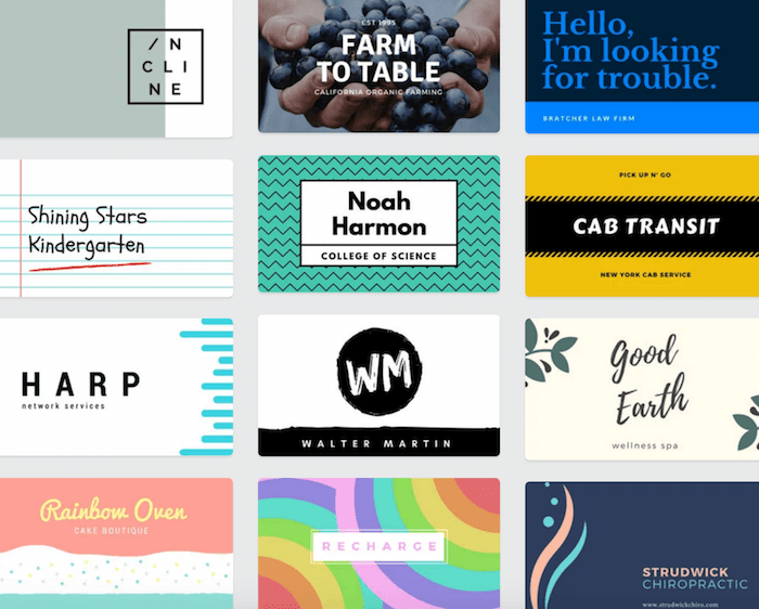
There are a variety of online services out there today, from mainstream sites like Vistaprint or Moo to small businesses who will make you custom cards in-house from anywhere in the world.
Or, you could opt for designing your own card on a site like Canva, where you can easily drag-and-drop elements and build from templates, or on software like Photoshop.
The two main things to consider when choosing between custom-made and online templates are time and skill.
If you're on a tight timetable (i.e., there's an event next week that you need cards for), opt for an online template to speed up the design process. If you're not on a deadline, however, consider going for something custom-made.
The other important factor, skill, has to do with your ability to make a custom card. If you work in a creative industry like graphic design, photography, or even marketing, you better have a custom-made design. If your expertise is more on the business side, like law, real estate, engineering, or medicine, it's more acceptable to use a template.
Die Cut or Classic Shape?
Die cutting is a fabrication process where you can cut paper and other thin materials into really nifty shapes. In terms of a business card, you could use die cut technology to create a cutout in the middle, interesting edges, or a unique shape.
Almost every industry can use a die cut design in one way or another--a chef could have a bite out of the corner of her card, a graphic designer could have a logo cutout, a fashion designer could have wavy edges.
The reasons to stick with a classic shape, like a square or a rectangle, would be a more serious look, minimal expense, and easier portability.
Professional Printing or DIY?
This one's a trick question--always, always go with professional printing for your business cards. If you buy Avery paper and print cards from your own computer, they won't be as sturdy or professional as a company could make them.
You'd have to invest in some high-quality paper and printing equipment if you wanted to match professional quality, which would end up taking more time and costing more (read: totally defeats the purpose of DIY).
Paper or Plastic?
No, this question isn't limited to the grocery store checkout. Plastic business cards are a new trend that are more durable and unique than classic paper ones.
On the flip side, they might also be more expensive. Choosing between paper and plastic really comes down to the type of industry that you're in.
If you rely on recurring clients who call you in times of need, like a plumber, handyman, landscaper, or therapist, a plastic card is a good choice because of its durability. Heck, you might even want to give out magnets.
On the other hand, professions with one-time clients or a focus on networking, like lawyers, architects, or web developers, are better off with paper cards.
And if your brand emphasizes sustainability, it's important to consider that paper business cards are a better choice for the environment since they can be recycled easily or even made from recycled materials.
Colorful or Monochromatic?
This question might seem trivial, but the colors in your business card have a lot to say about your brand.
On the one hand, you could choose a colorful layout by incorporating complementary colors, primary colors, or jewel tones.
On the other hand, you could stick to a monochromatic scheme where the color is the same throughout and only varies by how light or dark it is.
Remember that monochromatic doesn't necessarily mean black and white; you could have a monochromatic card made of different shades of blue, for example.
Whatever you choose, make sure you reference the color wheel to make sure that you stick to a solid scheme and take a look at this guide to see what emotions your colors may evoke in people.
Slim or Standard Size?
Slim business cards are just as wide as regular ones but lack the height of a classic business card.
While slim business cards look sleek and modern, it might be harder to find a carrying case to hold them in, and they may get more easily lost once you give them away. To decide whether or not to get slim cards, follow the same guidelines as paper or plastic.
For a more enduring, practical card, standard is the way to go. But if you're looking to be unique, memorable, or especially modern, try a slim design.
Six important decisions later, you're one step closer to creating the perfect business card for your brand.
As you take all these choices and combine them into your final product, remember not to stress too much about getting everything perfect--unlike a logo or a brand name, business cards can change as often as you think of ways to improve them.
And while a business card is certainly an important part of your first impression, it doesn't have to be perfectly optimized to get the job done. As long as you avoid major pitfalls like printing the cards yourself or choosing a design that's inappropriate for your industry, your business card will only help your brand along towards success.


