hotel wailea maui Business Card Design Example
adminShare
Purple Sophistication
Hotel Wailea is a place for Romance and steamy-hot lovemaking ― an adult only paradise.
It is located in the heart of three Hawaiian Islands that not only possess otherworldly beauty ―in the form of sprawling golf courses and breathtaking scenic views − but also provide a retreat from the hustle and bustle of city life.
Hotel Wailea is the perfect place for couples to rekindle the sauciness of their relationships.
It’s strictly an adult only resort, and the only one in Hawaii, meaning it has exclusivity written all over it.
The management at Hotel Wailea suggests reserving a suite beforehand despite the fact that it has them in abundance, 72 in total.
This means that its grounds are always booming with business, attracting couples all-year-round.
I believe the designer has made this card keeping this information in mind.
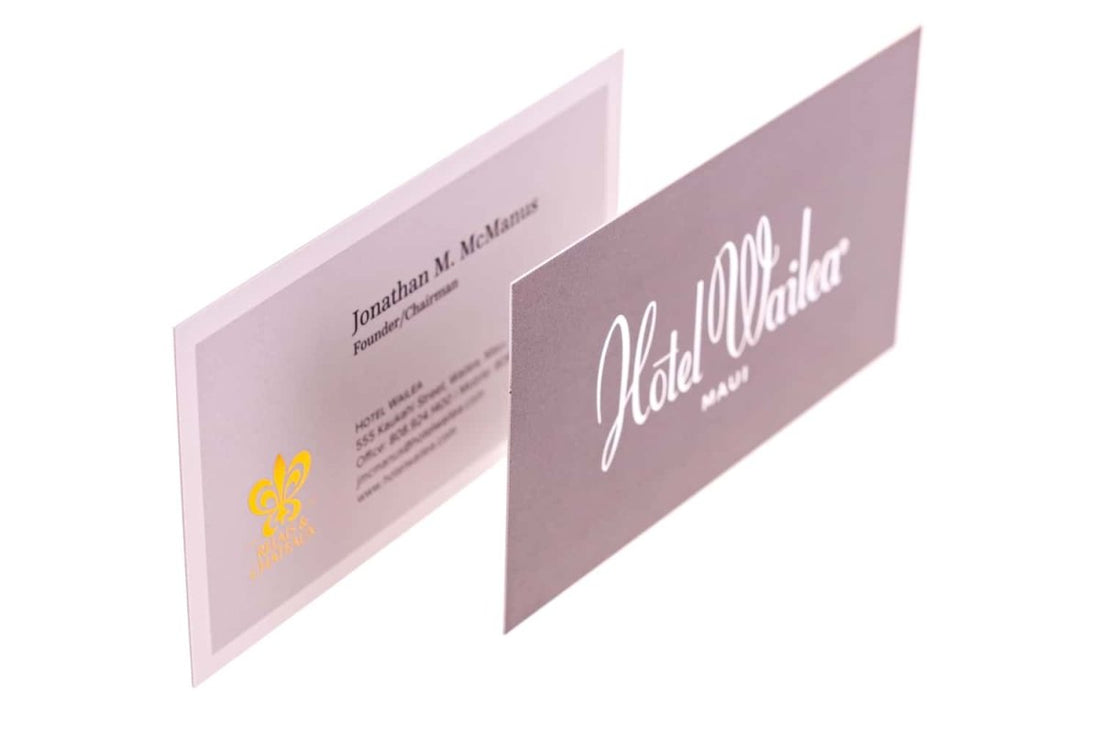
The front of the card is effortlessly simple, containing only the name of the resort and its location. I’ve already pointed out in previous cards how unnecessary details can make the card seem stuffed and confuse the reader.
Designers leave empty space on the card to portray a sophisticated image of the business in question. And that’s exactly what this designer has done.
I also love how the purple background and the white stylish font go hand in glove, producing an amazing contrast.
On the backside, the font has been kept really professional and easily legible. Why? It’s because the backside often contains important information, such as contact details, the name of the owner etc. If these details are hard to read, even in the slightest, it can cause problems.
This design proves two things, the maker of this card knows the essence of Hotel Wailea, the message it wants to convey and the psychology of the reader.


