guarded tree financial Business Card Design Example
adminShare
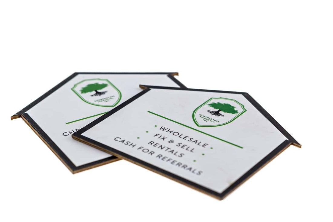
The Die-Cut House
This is another die-cut business card that is an excellent example of showcasing your brand’s message and personality. If you’re in the real-estate business, the shape of this house-shaped business card will suit your brand personality perfectly well.
And it’s not just about the shape. The company’s services are bulleted in a visible typeface in the center. Notice how condensed the text is? The designer has kept the business card straightforward and to-the-point ― no beating around the bush― so that the reader doesn’t have to double guess about the company’s core mission.
The rest of the space is occupied by white space and the company’s logo. I love how the logo is in perfect proportion to the card’s size. It doesn’t seem like an overcooked decoration.
The black margins are also a clever choice. They give extra exposure to the shape and geometry of the card and keep the reader’s attention focused within the confines of the business card.
The choice of color palette is also quite delectable. The black text and the white background complement each other with grace and elegance.
I love simplistic cards like this that say a lot in just a few design elements.


