Go Go Luna's Holograph-Inspired Business Cards
adminShare
At Print Peppermint we love all our clients! We get so inspired by watching young entrepreneurs and start-up founders create brand collateral for their company. We feel very blessed to be a part of this process.
One such client that we've really fallen in love with is: Go Go Luna
The Client
If you're looking to say happy birthday or thank you or write to your estranged uncle in a super clean super fresh sort of retro hundred percent awesome greeting card then... gogo Luna.com is the perfect fit.
Although we've helped Gogo Luna produce a variety of collateral pieces including their folded 5x7 greeting cards with holographic foil, today I want to focus on their business card.

In their about section it says they are in love with all things:
"Illustrative, abstract, minimal, modern, patterns, pastels, and all things shiny. . . these are just a few of their favorite things."
They have applied this Love and aesthetic to their business card as well. I'm not sure which one of the gals designed this piece but either way, it's super cool.
The Design
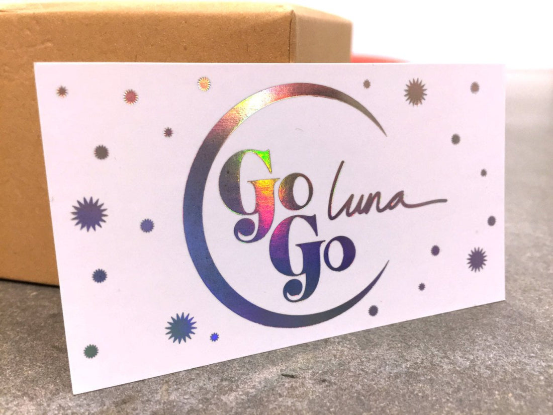
Their logo is very simple. A crescent moon with a very bold serif font for "Go Go" and a sort of handwritten or script type font for "Luna". The logo is surrounded by starbursts in a variety of sizes. (To learn more about fonts, check out our post - https://www.printpeppermint.com/get-noticed-5-best-fonts-for-business-cards/
And, the entirety of the information on the front is applied with a rainbow holographic foil stamp.
The backside of the card is very simple. They continue with their serif font which kind of has a vintage feel and a simple one-color black print for their mission statement:
...a vintage heart with a modern mind...
They list their website, twitter handle, and their email address
Video Demo
Paper
For the paper and they chose a Standard 18 point silk matte laminated paper.
Your Thoughts?
If you are a graphic designer or fancy yourself a creative person with a good eye please leave us your comments on how you would have designed this piece.
How the design could've been improved? The typography? Or would you have chosen a different set of production specifications? Different paper? Different foil color?
We're always happy to hear from you so leave us a comment below and let's start a conversation


