ellusionist magic training Business Card Design Example
adminShare
Eugene Woronyuk’s message to aspiring creative designers: make the text as readable as possible.
This might seem like simple and outdated advice, but it’s actually quite important.
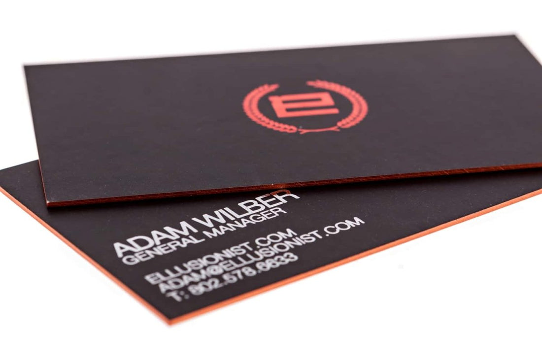
In the above card, the designer could have used a comic sans or some other fancy, cartoonish font, but he didn’t. He knew that it would not only look funky and off-beat with the elegant and mannered black backdrop but also compromise the legibility of the text.
One thing I love about this business card is the painted orange margin. It gives the card a “3-D, modernistic” vibe that is hard to miss.
Flat cards are a thing of the past.
My advice: do everything you can to make your card pop. You can use UV spotting to make the text or logo popup or use painted margins, as is the case in this business card.
One thing that you should notice if you want to design great business cards is the huge swath of empty space.
The more the empty space, the more the card looks spacious and inviting. That is why the designer has kept the copy to a bare minimum and focused on allotting acres of land to the indispensable empty space.


