Dog Groomer - Logo & Branding
adminShare
We recently completed a new brand package for a local dog grooming outfit out of Texas and we wanted to share it with you.
Debbie Gerdes, the owner, tasked us with designing her a new logo, establishing a brand color palette, and printing her some spiffy new business cards.
Since she is such a fun-loving lady we thought it only fitting that her logo and brand match her outgoing personality.
Here is a look at the initial black and white concepts that we sent her.
The Logo Design
We wanted her logo to definitely have a feminine feel and we provided her a variety of concepts that range in style from - high fashion to retro 50s hair salon.
Although for many applications, sophistication is paramount, we felt for this type of business, which is so personal, something super fun would be a good fit.
After a little bit of consultation, we edged her toward concept H2, the last page in the above PDf.
Here is what the color logo looks like:

The Business Card
To give her some flexibility in her print and online print material we added a second color to her palette for the business card, have a look below.

For the paper, we chose our mega-popular 20 pt suede/soft-touch laminated paper stock.
As you can see in the above proof we also decided to highlight her logo with our new 3D raised spot gloss UV process. This really draws attention to the dog illustration and provides a fun tactile experience for thumbs young and old.
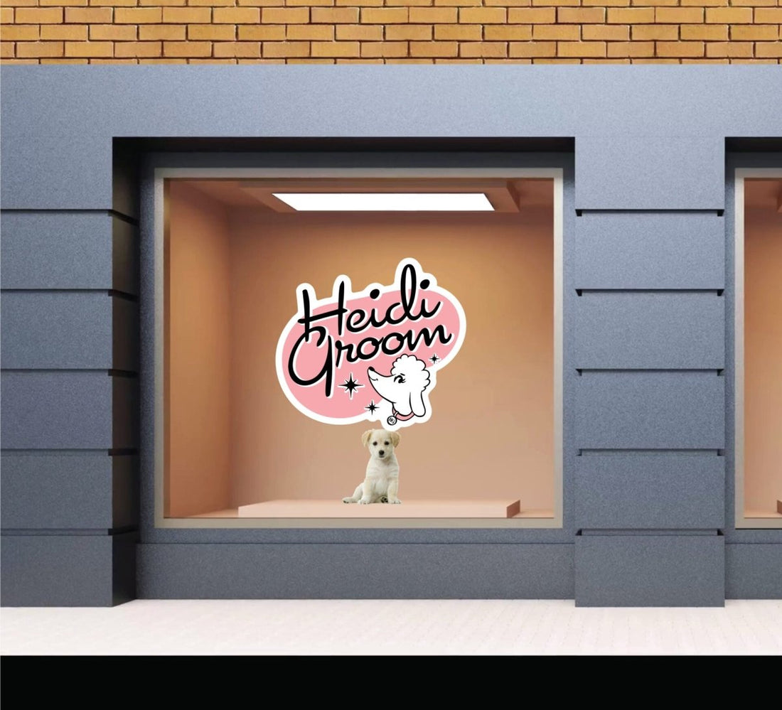
After the business cards were printed and shipped, Deb returned to us for a die-cut window decal as signage for her physical dog grooming shop, located in Flower Mound, Tx.
Here's what our mockup looked like:
The Signage

How much is the doggie in the window? Arf, Arf!
Well, we had lots of fun working on this project and we wish her a most successful launch to her new business.


