design life architecture interiors Business Card Design Example
adminShare
Design Life is the new name in town, with the motto “Your life, Our Design.” If you visit their website, you will see images of pillows and interior design arrangements of water taps and open doors, and other architectural elements ― all beautifully presented and placed.
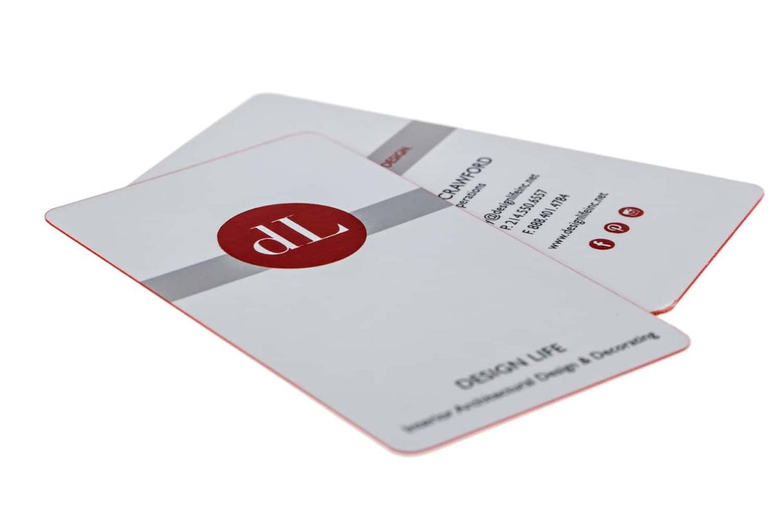
For a business who proclaims to design your home and workplace without intruding your personal space, the prolific white or empty space in the above business card is the right call. Not only does it draw the reader into the company’s name and its contact details, but also symbolizes the company’s work ethic.
And trust me: these little details make a world of difference. You can't undermine their importance.
The round corners give the business card a premium and decadent look. Their red margins give a neon and futuristic feel to the entire business card.
The clean and slick white backdrop produces an appropriate contrast with the central red logo. The typography is also legible and neat.
Although, I would suggest using a logotype that’s funky and upbeat in a card like this. Where everything is covered in a white evenness. In every other aspect, the card hits-the-bulls-eye and is quite likable.


