darren frank consultant Business Card Design Example
adminShare
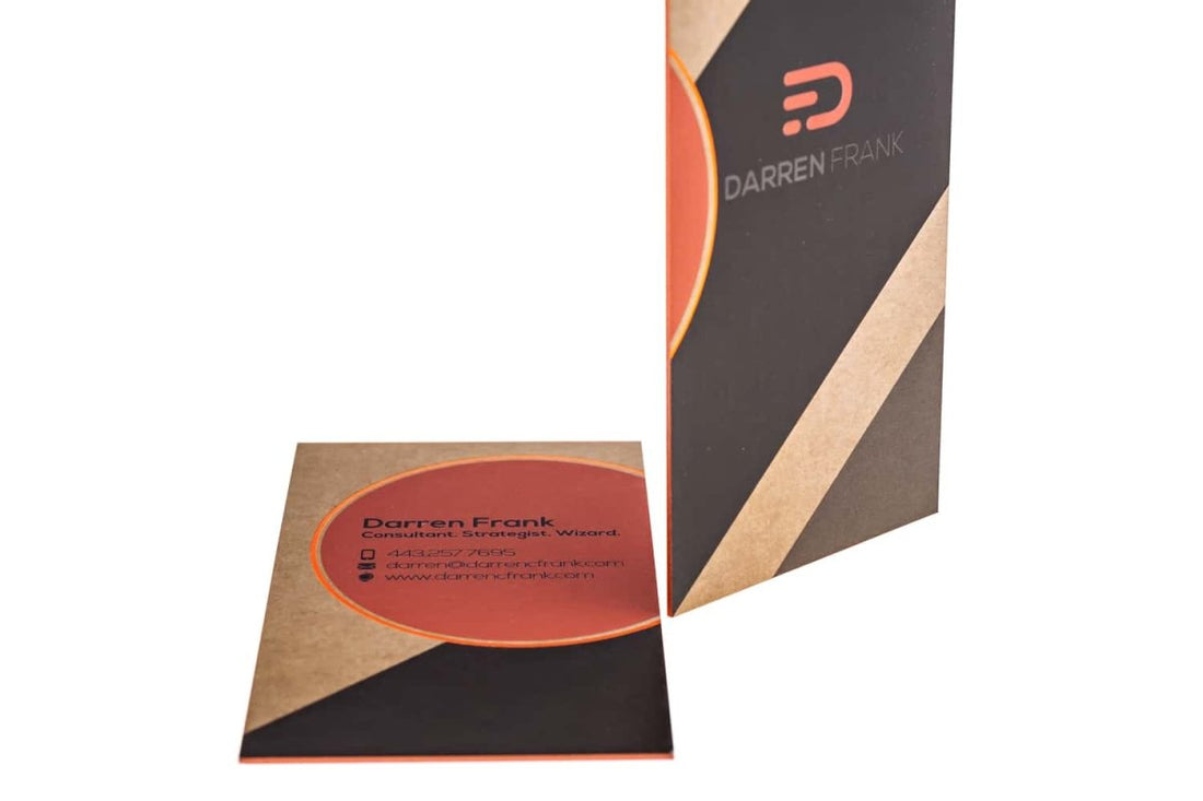
Let the colors of your business card do the talking for you.
The earthen shade coupled with a crisp orange and black set the tone for this simple yet effective business card. The colors zigzag and cross paths without spilling into each other creating wonderfully neat and slick patterns.
I love how the designer has confined the contact details and the title of the professional in a partial circle; it frames these crucial details and gives them extra exposure. Its unique roundness also covers up for the rectangular blandness of the card astutely.
The classic font adds to the professional vibe of the card and offers a visible and neat image of the brand to the reader. Everything about this card is slick and smart. It’s like having a glimpse into the organized and disciplined and fun workspace of a successful business.
For a consultant strategist who also identifies himself as a wizard, this business card is a fitting representation of his talents and professional profile. I admire the designer’s vision and his constraint to keep the design elements to a minimum. He has directed his energy and focus to highlight what’s most important for the professional in question ― Darren Frank ― and refrained from unneeded embellishments.


