dark matter collective Business Card Design Example
adminShare
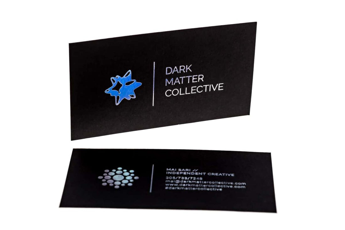
In this business card, the brand logo and the brand name are placed side by side, instead of the much too common pattern where the name comes under the logo.
This play with the dimension of the logo as well as its texture is clearly echoed in the special printing method used on this business card (Verena Michelitsch).
What is even more creative about this business card is that its back contains what would be the back of the brand logo itself.
Another play with dimension, to say in the least. The logo, therefore, stands out. It appears wholly organic.
What I admire most about this card is the color theme and tone. The blue and black blend artistically into each other; especially in the specific tone and shade, they are used in.
The blue of the logo is giving off that mystical-magical vibe, whereas the name of the brand itself echoes that vibe.
Another attribute of this card that stirred my interest was the way the last sections of the brand name seem to be “fading out” just as the logo is from below. It is almost as if someone held a blue light on the left side so that it fell on the logo plus text in a single file.
What a creative technique to represent something so simple. Such techniques are what make a business card memorable.


