cutlass cabana Business Card Design Example
adminShare
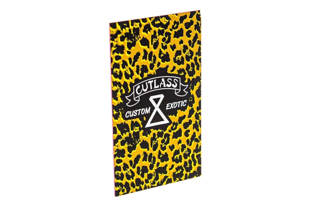
A business card such as the one above using a color combination of black and yellow makes the black foil of the card pop off of the yellow nicely, bringing attention to both the colors simultaneously instead of the brightly-lit yellow alone (Primo Print).
Color psychology, if used in the right way, can be incredibly useful for your business card. It not only helps convey your brand identity and brand message but at the same time, makes your card quite memorable.
This particular card uses black and yellow colors in its cheetah printed surface.
What I think serves as the most prominent attribute of this specific business card is the fact that the word Exotic in the brand name is reflected perfectly in the typography, color and background of the card.
It gives off an exotic vibe itself.
Last but not least, the brand logo could not be represented more perfectly than in this vertically cut shape. The orientation of the brand logo and that of the card both match, adding up to its perfect design.


