cool kids morphine city Business Card Design Example
adminShare
The typography on a business card should be friendly, comfortable looking, while professional at the same time.
It should be such that the brand name and other text, if any, can be visible and retain above-mentioned qualities for editorial, packaging, and advertising as well as app and web design.
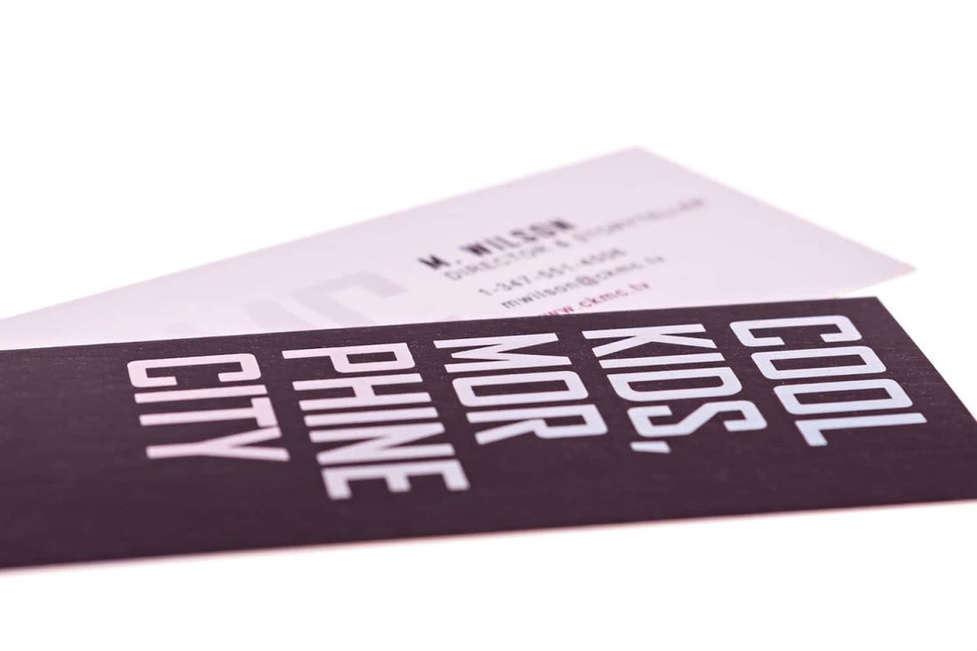
The typography of this business card is capitalized, but the capitalized text combines with the lower-case text, making the card suitable, as a whole, on screen and for small text sizes on newsprint paper, too (Floodfonts type foundry).
I find the specific typography used for this - giving off a digital vibe - and the color it is used in to be a perfect match. The aesthetic sense is bouncing off of this business card as those colors and capitalized typography blend with the vertical shape of the card.
It is a challenge to blend such opposing elements in a space as small as a business card. But this one does it fairly neatly.


