How to Design a Logo: The 5 Most Basic Rules
adminShare
It can be said that a logo is the pictorial representation of a company. It is a symbol that goes everywhere an organization leaves its marks.
According to the Picture-Superiority effect, people are most likely to engage in and remember information that is visual instead of being text-oriented. Consequently, a good logo is surely a quick and reliable way to get a head start in brand recognition.
The evolution of technology and rapid industrialization is leading to fierce competition. However, sticking to the following 5 rules throughout the course of logo designing can provide your brand with a solid competitive edge.
- Lay a Strong Foundation
It might be tempting to rush to the drawing board and get your creative juices flowing, but it often results in leaving the logo incoherent with the nature of the company. A good logo should mark a strong statement about the brand.
To avoid the ploy of ending up in the logo being aloof, ask the right questions:
- What is it that sets you apart?
- How do you do things?
- What are your core values?
- What is the vision of the company?
Once you get past this stage, begin with the preliminary sketches. There is no shame in grabbing the sketchpad and doing it the old way!
You can also sketch it on the digital platforms if it suits you. Get your ideas flowing across the pages and try experimenting with the sketches until you establish a gist of your logo. Then proceed to build upon it.
- Choose the Right Colors
Colors play a pivotal role in the recognition of a brand. If you mess up at this stage, you miss a great opportunity to get your logo to evoke the right feelings.

In the field of human psychology, color psychology constitutes a whole domain in itself. Each color kicks in a unique kind of feeling upon observing it—yellow having the optimistic vibes; red conjuring up the excitement. Therefore, it is very important to choose colors that correspond to what you want to deliver.
Moreover, a competent logo design company always sticks to the following essentials and makes sure that the logo:
- Doesn’t lose the essence in black and white, and grayscale
- Cuts down on overly-bright colors that require effort to observe
- Utilizes colors that are closer in the color wheel
Ideally, your logo should work in the black-and-white mode just as similar as in the colored version. So, another rule of thumb is to never let your colors and gradients make an important distinction in your logo, for the effect cancels out in black and white.
- Keep it Simple and Balanced
Antoine de Saint Exupéry stated that perfection can be achieved, not when there is nothing extra to add, but when there is almost nothing left to take away.
Let your logo effortlessly deliver the content and keep a balance between style and substance. Make it cluttered with unnecessary colors and effects, and you lose the touch of simplicity. As a matter of fact, studies indicate that majority of the leading brands use a combination of two colors in their logos only.
Additionally, it is important to ensure that one part of your logo is not too loaded in detail that it ends up overshadowing another.

The whole point of simplicity is to get the logo easily recallable and recognizable. According to Pam Moore, a person takes 5-7 observations to get familiar with a logo; don't let yours take more than that. Big names such as Nike, McDonald's, and Target offer the epitome of simplicity: say the word, and the logo pops up in your head.
- Never Compromise on Readability
Descriptive logos play a great part in winning brand loyalty. It is vital to make certain that you are not compromising on the readability of the text in your logo by incorporating eccentric fonts.

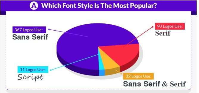
Upon analyzing the list of fortune 500 companies, it appears that 73% rely on Sans Serif fonts for their logos. The reason is simple: It is easier to be read. Even if you want to include diversity in your text, going for more than two fonts is a disaster.
Speaking of disaster, better avoid the following blunders in your logo:
- Incorrect capitalization
- Eccentric fonts
- Inconsistent letter spacing
- Bad font sizes
Another factor that dictates the readability of your logo is Proper Scaling. This means that your logo is flexible enough to stay clearly visible and consistent when it is scaled down for the size of a business card, or scaled up for a billboard.
- Make it Look Professional
Sometimes we are so drawn in oozing out our creativity that we fail to get the basics correct. As a result, our work falls short on maturity, and it doesn’t leave a good impression on the viewers.
If we look at the example of Twitter, the company made changes in its original logo only to refine the accuracy of shapes in it. So, if your logo includes shapes, it is very important to make sure that your logo disseminates shapes precisely. A square should look like a square, not a rectangle.

Another essential element is to use a vector-based software to create your logo. This is important because upon scaling up, a vector logo doesn't lose its quality, unlike the raster models. In addition, a lot of modern applications such as vinyl cutting and embroidery machines operate on the vector models only.
Moreover, a logo with a bad aspect ratio spoils every creative effort put into it. The last thing you'd want to do is to make your logo appear awkward by having out-of-proportion horizontal and vertical dimensions.
Conclusion
Once you get the basics right, step up the game and come up with versatility. Show it to the audience that your brand stands out from your competitors by incorporating something in your logo that sets you apart. The Coca-Cola logo is still amongst the most recognizable logos in the world because of its iconic custom font.
People hold things in high regard that put a smile on their faces. You can always make your logo engaging by adding a hidden element in it. Similarly, you can tell a story through your logo as well. The more you communicate through it, the closer you get to the audience.
Lastly, never forget the following quote to set the bar the highest it gets.
“Know the rules well, so you can break them effectively.”
― The Dalai Lama


