10 Paper Design Tips to Take Your Brand to the Next Level
admin
Amidst all the digital hype, print media has still not lost its charm. Paper is where ideas unfold and your brand story is told.
You still exchange business cards when you meet someone new, right? Plus, nothing can beat the vibe of reading a magazine with coffee by your side. Newspapers are still the start of the day for most people in the world. And, who can ignore those pretty colorful brochures?
Although businesses concentrate more on their digital platforms now, no one can ignore the influence of good old paper media. Printed marketing materials still generate a significant amount of revenue for businesses. In fact, they are the pillars of every successful brand. When designed using interesting techniques and trends, they have an unmatched influence on your customers.
This blog is all about paper design. First, I will give you a little background on this essential art. Then, there are a few paper design tips that will empower your brand.
So, let’s explore the power of paper together!
The Background

Printing on paper laid the foundation for modern knowledge-based economy. It has gone hand in hand with the social and economic developments over the years.
Do you know the story of how paper printing was used to advertise for the first time? Well, it’s a really interesting story! The first advertisement was written on behalf of Hapu, a weaver in living in Thebes, Egypt. The advertisement said that he had lost his slave and people should help return him. Besides that, it mentioned a detailed appearance of the missing slave.
He offered a gold coin for any news about his slave’s whereabouts. Now the key thing to notice here is that he also added a line of self-promotion in the last. In that line, he called his shop a place where the best cloth is woven to the desires of the customers. All of this was written on the remains of papyrus dated around 3000BC.
Then came the printing revolution of the middle ages. From handwriting everything, we moved on to the mass production of books in a printing press. Newspapers and magazines became explosively popular during the industrial revolution. Even with the advent of radios and televisions, print media still held enough importance in marketing activities because of its portability.
However, print advertisements has finally taken a back seat with the invention of smartphones. People can read magazines, advertisements, and newspapers online now. But, guess what? Even though print media is just left with a supporting role in branding, these technological developments still can’t beat the feel of physical interaction that paper provides.
Even in today’s digital era, we cannot ignore the influence of paper. That is why we still need new and effective paper design techniques to market ideas, products, and services.
Paper Design Techniques for Effective Branding

You want your business cards, brochures, flyers, and other print marketing materials to make a positively strong impression? Well, here are some paper design tips to help you.
Avoid the Rainbow

We all love colors. But does that mean you should infuse a hundred colors in a single design? No! Firstly, the more colors you include, the more risk you face. The colors may clash with each other or may not blend the right way if you have a complex color palette. Secondly, too many colors may make the text hard to read. Thirdly, fewer colors mean low cost of print. As they say, keeping it simple can never go wrong.
Leave Enough Space
A design with text and images all pressed together tight doesn’t sound nice, right? It’s always better to leave enough space between the different visual elements on a page. Plus, you should especially make sure that there is enough space on the page for borders and margins. Why? Because some elements may be trimmed off from the paper during the printing process. This is more crucial for smaller paper prints, like a business card.
Consider the Print Paper

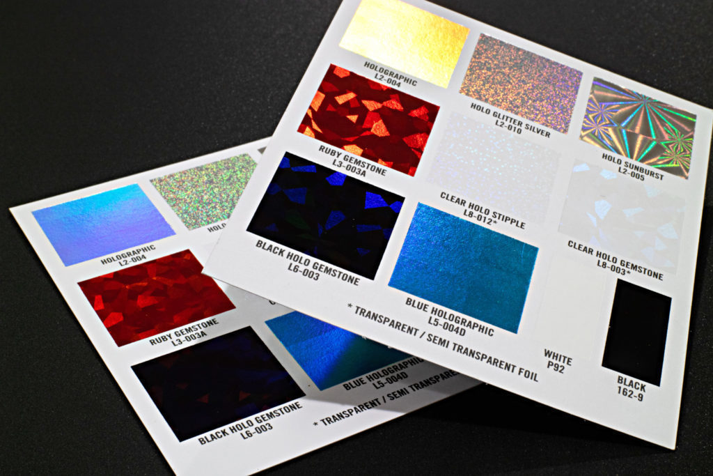
Everything is designed on screens nowadays. However, things that look good on a screen may not have the same effect on a paper. People often overlook the kind of paper their design will be printed on. They finalize the design if it looks nice on the screen which is totally wrong. The texture, color, and thickness; everything impacts the final printed piece.
You have two options: Create a logo design and then finalize the kind of paper for the final print, or finalize the paper you want to use and then create a custom logo design according to that. This makes sure that your design blends well on its final destination.
Play with the Layers
Flat paper designs are now officially boring!
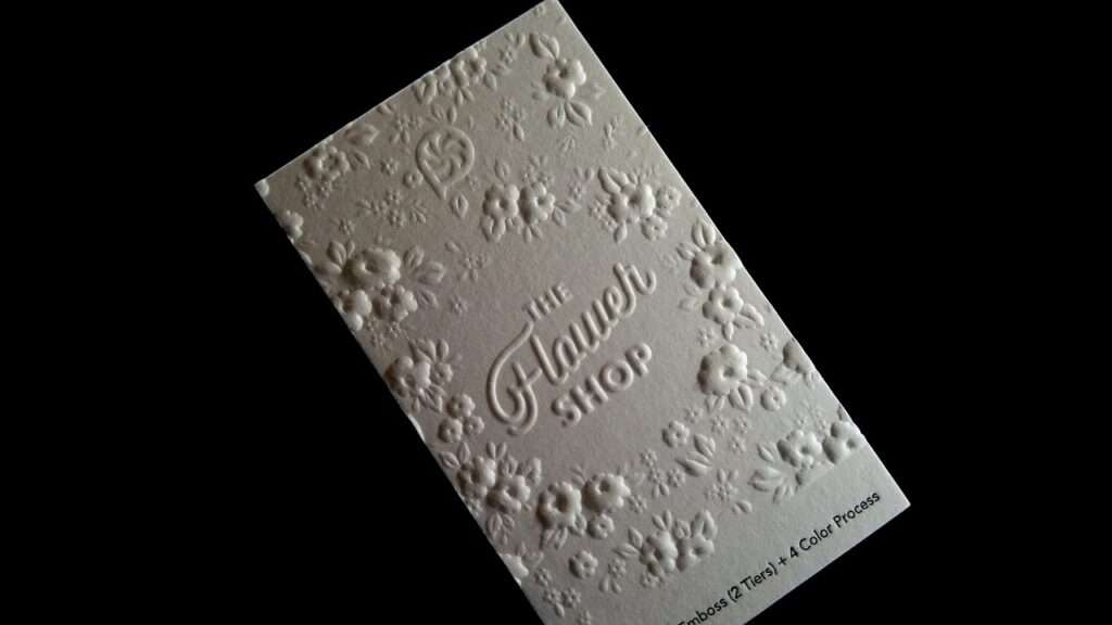
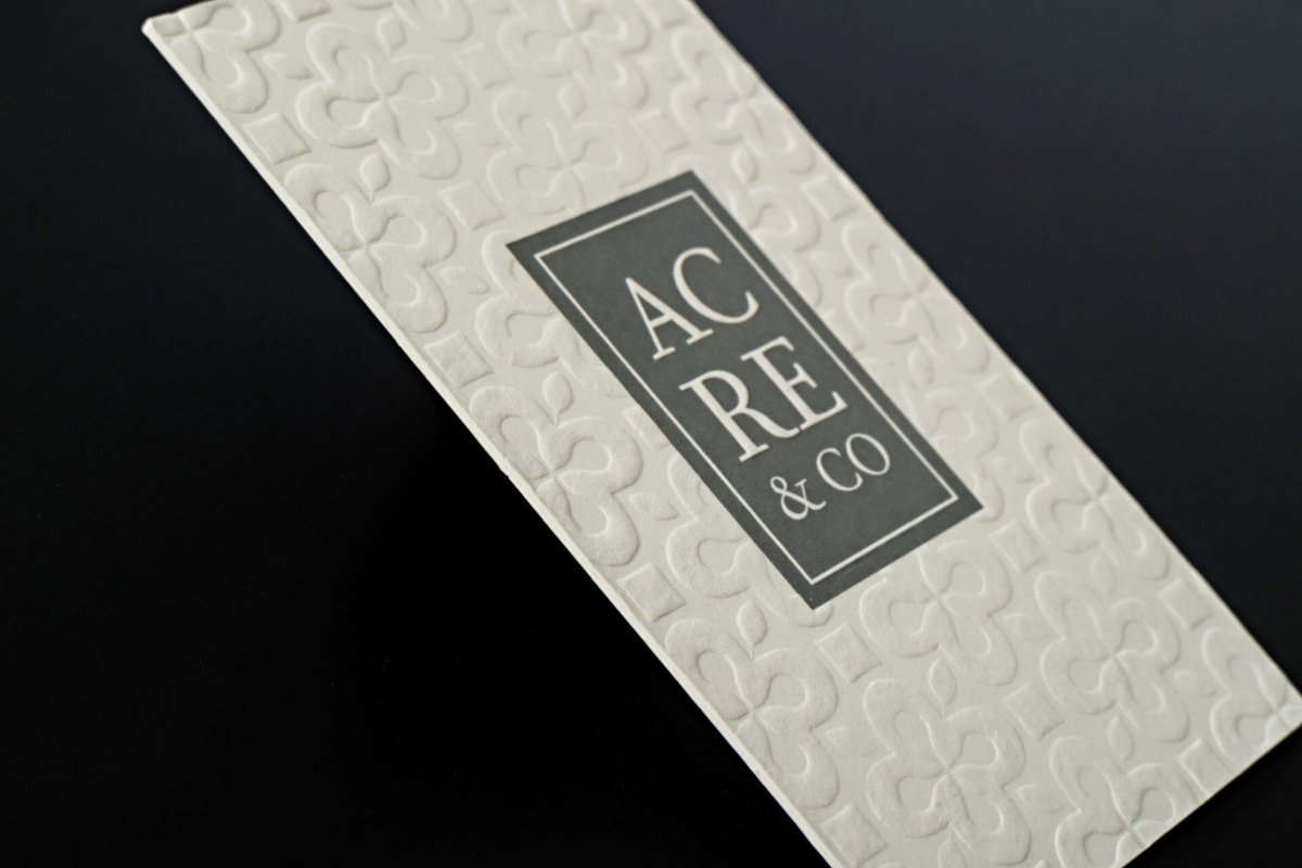
Grid system has made it possible for us to create multi-layered layouts on the paper. It means you can layer up the elements on each and make them look more unified and realistic. You can play with the fusion of text over graphics, graphics over colors backgrounds, or images over type. There are numerous possibilities of making a paper come alive with different elements positioned together!
Try Unique Paper Sizes
There are standard paper sizes for books, magazines, brochures, etc. But who says you have to go by the rules? In the world of design, you can always experiment with something different. For example, why not go for a square booklet instead of a standard size guide book? It gives a more interesting vibe and are easier to carry too.
Go for the right images
There are two kinds of images: raster and vector. Raster images are made up pixels while the vector images are constructed with mathematical calculations. On high resolutions, a raster image may begin to pixelate and print badly. However, a vector image does not change much when scaled on larger or smaller mediums. Vector images usually look smoother on paper prints.
Use the Borders Correctly
Borders are a great option to spice up a design. However, they don’t always fit in well with the overall design. Borders are better avoided if they make a paper design look crowded. They only look elegant when you have enough space for them on the paper. Leaving
Author bio
Linda Hartley is a digital marketing manager at Appstirr, who loves to write content on the latest topics, including Blockchain, B2B business models, application development and much more.


