Analogous & Complementary Colors - What's the difference and how do I use them in my Graphic Designs?
adminShare
Color is the most basic element in a design. Choosing the right color is key no matter whether the design is meant for marketing, promotion, branding, or simply filling a gap.
Understanding of colors depends on many things, and colors have different interpretations in every country because people of different cultures associate colors with different colors.
When it comes to graphic and web design, you should start by getting to know your audience. Who will be viewing your design? What kind of emotions will your design evoke?
After that, you can select the most suitable colors you have at your disposal. Which colors should be combined, and which colors don't run with each other? Today we will talk all about colors and how to use them in your designs.
The Color Wheel
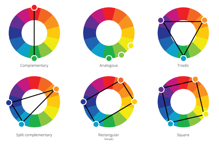
It is a wheel which comprises of various colors and allows us to visualize the relationships between different colors. A conventional color wheel consists of 12 hues.
The color wheel is composed of primary colors, secondary colors (obtained by mixing primary colors) and tertiary colors (by mixing primary and secondary colors).
You may be thinking, how the color wheel can help me with choosing a palette? Well, you don't need to worry for we will tell you some visually pleasing color relationships which will help you get started.
Analogous Colors
Analogous colors are those which are placed next to each other on the color wheel. They generally match well and create smooth and serene designs.
Analogous colors are harmonious and pleasing to the eye. Analogous colors are widespread in nature as well.
When you use analogous colors for your design, then you need to ensure that they have enough contrast.
You can choose one color to dominate and the second as support. You can even add a third color as an accent.
Complementary Colors
Complementary colors are those which exist exactly on the other side of the color wheel.
A vibrant look is created in your design when you use a high contrast of complementary colors. This effect is even more pronounced when you use the complementary colors at full saturation.
Complementary colors are a bit tricky to use in large designs, but they are a great way for making something stand out. Complementary colors must be handled well to avoid making them jarring.
Complementary colors are extremely difficult to use in the text, so if you intend to use them in your typography, then you need to be careful.
Poor use of complementary colors in type is a common designing mistake.
There are many subcategories of complementary colors, like split complementary and double complementary.
Where to look for new color combinations?
You should search for inspiration all around you when looking for colors to use in your designs.
Look outside and absorb the natural hues, look at established works of art across all disciplines to explore new color combinations.
If you want to conjure up some truly eye-catching palettes, then you will have to step outside of your comfort zone.


